Great landing page content always produces sales. Conversion copywriters are a mixture of writers and psychologists. They know how to make a user push the button and buy something. They create engaging content. It grabs readers’ attention and keeps it until they reach the bottom of the page. So, how to write great content that can be a game-changer for your landing page sales? Here are some useful tips.
Use Your Customer’s Language
You must know your target audience well. Use their language, take into account their habits and desires. Define all the characteristics you can find on the web and in other sources. Make a list of questions that describe your customers.

- Who are your customers?
- What age are they?
- What do they like to eat/read/watch/etc.?
- How do they spend their free time?
- How do they speak?
- What are their hobbies?
Do comprehensive research and write down the answers. Read the answers and try to write the first sentence on a landing page as if you were your own customer. What would you like to read? Which message would attract your attention?
Address your message to a consumer. Stay focused when writing and always reread the text as if you were a simple visitor of your page.
Recommended for you: 10 Excellent SEO Friendly Blog Post Content Ideas.
Insert Customer Testimonials
Social proof is what makes your message convincing. Testimonials help your audience to connect with your text and engage with it as much as possible. Your customers need to know what experience they’ll get if they buy your product or service. Testimonials enhance the effectiveness of the statement on your landing page content. Never ignore them.
Social proof shows a reader that your product/service worked for many people. The more testimonials you’ll publish on your page, the more convincing your message will be. However, you shouldn’t go too far. Don’t use fake testimonials. Most people have good intuition and can distinguish the truth from the lies very fast. One of the earliest types of testimonials and also one of the easiest to acquire is quotes. There are 3 main types of quotes testimonials:
- simple quotes;
- quotes with an image of a person;
- quotes with an image of a person and call-to-action.
Simple quotes
Simple quotes can be effective in case you use a very detailed testimonial. Never use platitudes such as “cool app,” “nice service,” “great work,” etc. The proof must be full of evidence. Compare these two testimonials:
“Nice online vocabulary! I use it every day!”
“Great vocabulary! I’ve been trying to find an app that will have not only the latest vocabulary database but also audio pronunciations and specific entries for each word. So you can learn the context as well. It made my studying much easier, and now I can learn both the word and its background as well.”
As you see, the second testimonial shows the value of the product. That’s how your message can be singled out for its outstanding features.
Quotes with an image
Quotes with an image is a much more powerful tool. However, you need to ask permission to use someone’s photo on the web. When you see a testimonial that goes along with someone’s picture, it is easier for you to emphasize.
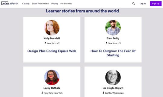
For instance, the Codeacademy customer testimonial page (above screenshot) is an excellent example of how a company should interact with all the customers. They collected learners’ stories from around the world and did a series of interviews with them. Storytelling plays an integral part in the credibility of any testimonial.
Quotes with an image of a person and call-to-action
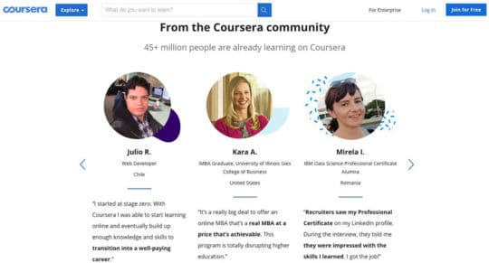
Quotes with an image of a person and call-to-action are great when you have an inspiring story. CTA is a coda for such a testimonial. It is what makes the user push the button and purchase your service or product. How about the testimonial section from an online learning platform Coursera? These few sentences describe a road to success. And hey! You can join for free! Isn’t it a wonderful idea?
Put the Most Important Message First
Remember that you are not writing a detective story or a thriller screenplay. No suspense. Place the most important information at the top of the page. It should be visible before a user starts to scroll.

Nowadays, life brings a lot of distraction to people’s lives. Social media somehow destroys the way we read and percept any kind of information. If something doesn’t seem interesting for us within 2-3 minutes of reading/watching/listening, then we’ll obviously shift the focus to something more exciting.
Patience is something that people of the XXI century don’t have. So you should take into account all the peculiarities of your readers’ minds. Think about the most important message you can place at the top of the page. Make a list of all the benefits your product/service has. Which characteristics can you single out? What makes it special?
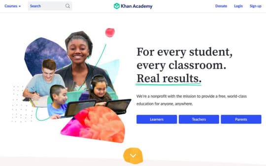
Write down 5-10 main ideas. And then compare them. Make a competition. Take one benefit and compare it to another one from the list. Then choose one. Compare the benefits until only one main idea is left. That’s your number 1 advantage. Now it’s time to create some cool slogans with this benefit. Let’s see how the top part of the Khan Academy page looks like.
The very first message tells you that it’s an academy that provides free education for everyone. Simple. Effective. Accessible. Moreover, the owners created three signup forms for learners, teachers, and parents as well. When you choose the one you want, you’ll find the extra benefits for your category.
You may like: How to Write Effective Product Description & Content to Grow Sales?
Write Engaging Headlines
An experienced copywriter knows how to compose an engaging title. Headlines also tell readers what they’ll find on the page. They explain why you should take the time to read the content on a landing page.

Many copywriters omit this rule and lose as a result. However, David Ogilvy once said: “On the average, five times as many people read the headline as read the body copy. When you have written your headline, you have spent eighty cents out of your dollar.”
So what are the main characteristics of a great headline?
1. Transparency.
Omit ambiguous terms, metaphors, and another verbiage. Let’s leave it to writers and poets. Your slogan must be clear and understandable.
2. Relevance.
That’s the thing most copywriters forget about. Take into account all the sources your readers came from. Was it a Google or a Facebook ad? What kind of message did your targetologist use in this advertisement? Your headline must be a natural continuation of the thought that was used in these ads. For instance, you mentioned on Facebook that your customers would have a 3-weeks trial version of your product. You should continue this thought the content on your landing page.
3. Empathy.
You won’t be successful if you don’t empathize with your reader’s problems. Feel the pain of your potential customer; try to understand what bothers him/her and offer a solution. That’s how you can win many hearts. And earn a lot of money as well.
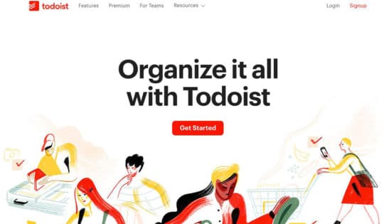
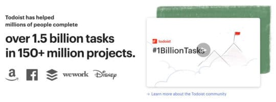
Take a look at the Todoist page (above screenshot). The very first message is clear and concise. It shows you the most important reason to use the app. Sometimes our schedule is a total mess. Besides, you can’t deny the fact that time is speeding up nowadays. So it is of great importance to keep all the to-do lists in one place.
Todoist shows the main features of the product. Their main message is that their app can help you to organize it all. All your household chores and work tasks can be kept in one place. If you still doubt, their copywriter mentions the numbers. See how many tasks were completed with the help of the Todoist app. That’s impressive!
You should take into account that most of the users pass long reads. They must be interested in the topic to stay on your page. So make sure you did your best to describe all the benefits of your product or service at the top of the page.
Use Statistics, Figures, and Facts
You can tell your audience that your product is great, and they won’t believe you. Tell them how many users improved their lives with their help, and you will have their attention. Compare these two messages:
“Our amazing courses helped a lot of people to make their dreams come true.”
“More than 2,5 mln people acquired a new lucrative profession with the help of our courses. Their average salary is 5000$ a month.”
The second message makes you press the register button very fast while the first one is very impersonal.
Example 1:
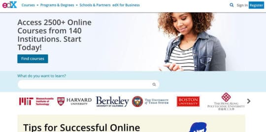
Add figures to impress your audience. For example, edX offers online courses, but so do many other platforms. What distinguishes them is that they mention the number of courses they offer, and it is indeed impressive.
Also, take a look at the superstar universities they cooperate with. This list enhances the level of trust at once. Moreover, edX is very consistent in what they represent on their landing page content (above screenshot). They not only mention the number of courses, but they also give you the list of the main classes afterward.
Example 2:
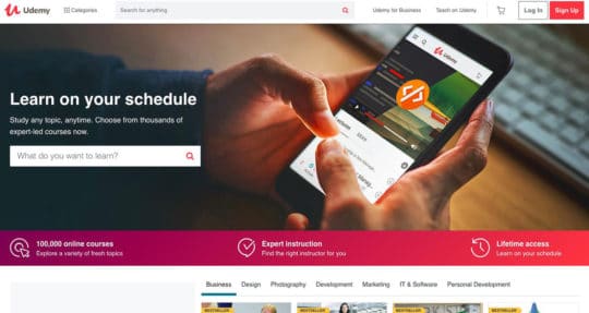
Another brilliant example of numbers and facts usage is Udemy. You’ll also find a search bar at the top of the page. It allows you to find the course you need at once. So you don’t have to scroll down and look through the full list of classes. It’s very convenient. Besides, the design is very welcoming.
The three pillars of their education are:
- a huge number of courses (more than 100000);
- ability to work with a personal instructor;
- lifetime access to all the courses you bought.
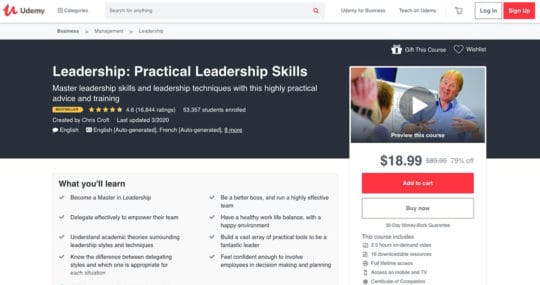
The content of their landing pages are very informative. On the course pages, they use a mixture of social proof (below the description of a course), the detailed description of all the classes (number of hours, lectures and the price of each course), and also the main skills you’ll have after finishing the course. All the information is located at the top of the page. You don’t have to scroll down to learn almost everything you need to know. That’s a brilliant example of how design and content should work together for your landing page.
Add some interesting facts about your product. Describe the creation process. Show how much effort it took you to develop it. That’s how you can show your business’s real value and move to open communication with your audience.
Structure your Text Properly and Make It Easy to Read
You should remember that a great landing page text is not only about sense. It is about structure as well. Create a framework for your text. Move from an exciting start to a no less amazing ending. Use short sentences to make your landing page content easy to percept. Insert headings to structure your long read and emphasize each new message. The font must be readable and not irritating.
Use pull quotes and short paragraphs. It will help a reader to understand your thoughts and not get bored. We all know that long text canvas never plays into the hands of a copywriter. As we know, people shift their focus very fast today. So make sure you don’t create a long and tedious sheet of text — separate text blocks with the help of images, videos, icons, and graphics. Alternate textual and visual parts to reach your goal.
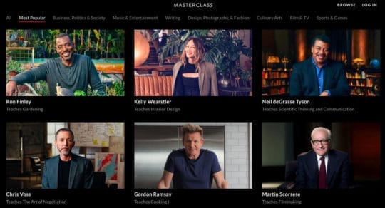
The MasterClass landing page is an excellent example of how to unite the textual and visual elements. Firstly, they come with a powerful message: “Learn from 80+ of the world’s best minds.” And then they move on with social video proof. We look at the interactive banners with superstars telling about their classes.
But that’s not all. If you didn’t recognize all of them, the brilliant mind of the copywriter goes on with the textual social proof. After you scroll down, you’ll see a list of superstar names: Samuel L. Jackson, Dominique Ansel, Natalie Portman, Armin van Buuren, deadmau5, Christina Aguilera and many more. Boom! That’s a knockout.
That’s not all. After you finish reading the list of the biggest names in the industry, they address you personally. Each coach recorded his/her own greeting. How cool is that?
You may also like: Corporate Video Content Crafting 101 – Video Marketing is here to Stay so you Should Join the Move.
Speak About the Benefits of the Product
Why is your product/service unique? What makes it so desirable, useful? Why do people choose or should choose you? Try to explain it in a couple of sentences first. Add visuals. Read the users’ testimonials to understand what they like best about your service or product.
Users have to be sure they buy the best thing on the market right now. Write down the list of knockout benefits your product/service has. Read them to your friends and family. What do they think? Are they impressed? Try to test the list by reading it to the people in your environment who can be your potential clients. Look at their reaction. Correct the benefits according to their thoughts.
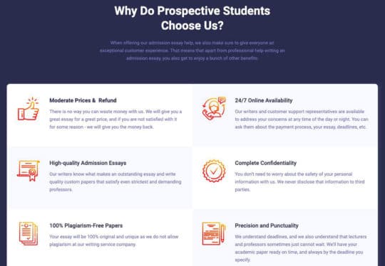
Take a look at essayservice.com (above screenshot). Each benefit is concise and clear. It addresses all concerns/needs of a student who is looking for some professional help with his/her admission essay and wants to get a quality, plagiarism-free piece at an affordable price at the same time.
“I need someone to write my college admission essay,” that’s the thought most of the students have before applying to the university of their dream. Essayservice uses it as one of the main messages. It guarantees a great connection with their main audience. Besides, you don’t have to search for additional information. They show you the price for one page of the essay in the very first paragraph as well.
