Website Design trends are always changing. Especially, when it comes to graphics and, of course, an appearance of your website, blogs or social media profiles. Everyone wants to be original, remarkable. And, here are top web design trends that are popular in current 2019 year.
Website design trends and technology has advanced significantly. Recent websites are developed exhibited cutting edge design concepts that ensure the maintenance of the aesthetic elements and the introduction of other features including video content, micro-interactions, and voice supporting interfaces. Just like fashion, these advancements become obsolete with time and are replaced with different modern styles. The year 2019, has seen the introduction of cutting edge, creative and clean styles.
Some of the best web design trends of 2019 include the following:
1. The design of value
Recent web design advancements have focused on creating the element of value. Websites are developed with the attribute of value which requires the application of principled thought process rather than analogical. The focus has shifted from aesthetics which only focuses on visual appeal to the integration of artificial intelligence to add value. The traditional interface-focused website development has slowly faded and has been replaced by designs which help in brand marketing. As a website developer, the recent shift in perspective offers not only the avenues of artistic impressions but also platform for intellectual and commercial value.
Recommended for you: What Millennials Really Want to See from Your Website?
2. A 3D illustration is in
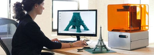
Some of the best graphic design trends of high definition display involve the creation of interactive and intuitive designs. The cut-out illustrations have been replaced by three dimensional and more vibrant interfaces that have, to an extent blurred the line between reality and the digital interface. The minimalistic web designs that previously characterized websites have been replaced by advanced and interactive models. These changes have raised the bar in artistic impressions that not only have the aesthetic appeals but also make you feel, think and marvel at the beauty of technology. Users already appreciate the value of websites with these new optimizations and advancements that add value to the developers.
3. More chaotic elements, bright colors
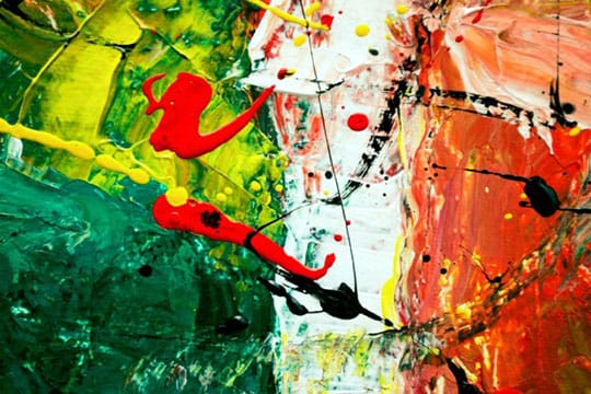
Recent website developments have eliminated the element of predictability that until recently, characterized most websites. The standardization of website elements has recently been replaced by more original, creative and chaotic designs introduced. The simulation of the chaotic elements within the human realm has added a touch of creativity that not only attract traffic but also contribute to the mental stimulation and visual appeal to the users of the website. To help you commercialize your website, the chaotic interface is incorporated by ad buttons. As a web content creator, companies like academic writing paper can assist you in the designing of your website to accommodate such ad buttons on your webpage.
4. Nostalgic/Retro design aesthetic
The new websites development designs have reintroduced best website design concepts, especially on creative aesthetics. The experimentation by blending nostalgic features and the retro designs create visually appealing interfaces that link the past and the present model and creative elements. These may include the addition of color schemes, icons, drawings and graphics presentations akin to those used in the past to help users reminisce and appreciate the history, creating a sense of nostalgia. As a web design that blends the present and the past has an emotional and creative appeal that draws visitors to your website. The throwback typographies used as a website background will help you in linking the past and the present.
5. Animated GIFs
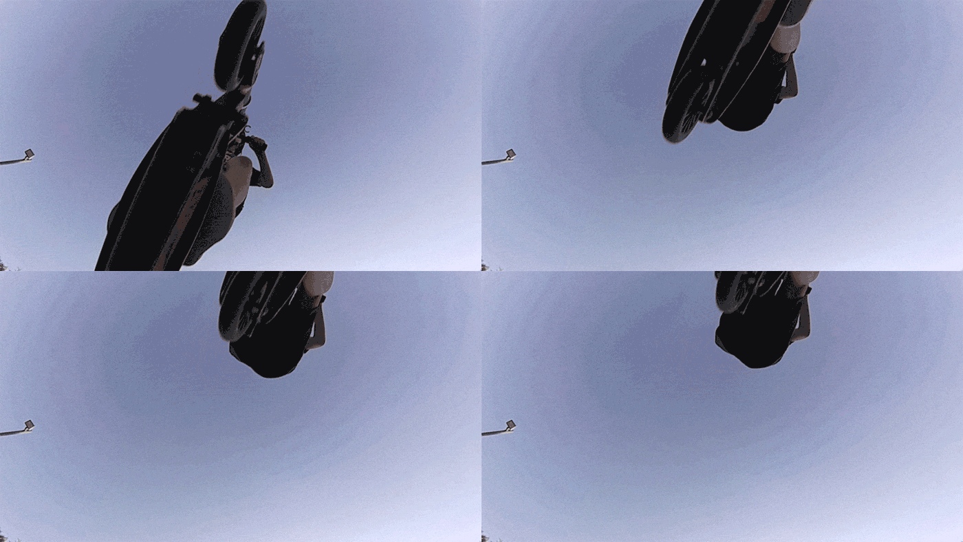
Recent website designs ideas for businesses have taken advantage of the desire and mindset of present web users for instant gratification concerning the sourced information within websites. As a website developer, you have a narrower window of time to appeal to the user by capturing his or her attention and imagination. To do this, the digital advancement has led to the spread of the use of animated gifs to convey complex information within the shortest time possible while incorporating creativity, entertainment, and visual appeal. The gifs used to engage and provide essential information relating to branding or service being displayed on the website.
6. Playful cursors
The primary cursor serves the purpose of helping you navigate the website interface and content with simple responsive clicks and dragging. However, recent web designs have provided more interactive cursors that can be customized to the design specification of the user via the navigation settings. The intuitive designs let users change the design of their cursors as they browse through the websites especially on mobile devices. The customizability allows users to select matching styles depending on the media content of the website as they navigate the webpages. For instance, if the website contains photography content, the cursor can be changed in terms of appearance and functionality such as holding to take pictures, dragging to crop or create animated gifs from the displayed contents.
7. Broken grid & asymmetrical layouts
This concept of website design involves the use of imaginary templates on imaginary lines that cut across the screen to help in appending the elements of the interface on display.
This type of design is experimental and tests the boundaries of web content with its uniqueness. It is characterized by a Brocken grid that runs through the layout of the website. Its asymmetric features and Brocken grid layout provide a unique display, breaking from the monotonous and rigid grid systems that have been used recently in website creation.
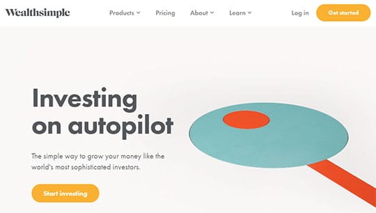
8. Use of white spaces
White spaces on a website are the portions of the page that have no content such as images, videos, and text elements. Previous web designs did not give room for white pages on the website. Recently many developers have embraced this feature to improve user experience through the simplicity of the black and white palettes. The white pages may not be necessarily white but are the empty non-occupied spaces within the website, created and left blank with the aim of maintaining a clean, simple interface. As a webpage designer, you can direct the attention of the visitors to blogs like WordPress or critical aspects of your website.
9. Pushing the boundaries of typography
New graphic design trends have implemented the use of different typographies in creating content for their websites. Most websites have adopted the use of, for example, bold typography in enhancing the appearance of their web content. This is a simple concept that has existed for a long time. However, new typographies have emerged that add a hint of creativity and visual appeal. This includes but not limited to the helveticization of the web logo and the use of bold typography used especially in blogs.
10. Purposeful storytelling
Storytelling, over the years, has propelled science an innovation. For example, various innovative creations have been as a result of stories told. For instance, Amazon Alexa creation and development was inspired by the Star Trek story. The year 2019 and beyond will undoubtedly see more websites inspired by various stories. This would include the focus on detail and viewing ideas in the bigger picture and incorporating them in such a way that there is a free and consistent flow of information.
The main website design idea is preparedness for eventualities, defining and designing all the moving parts in such a way that they merge and flow like stories. Inspirations from stories can also help in creating scenes that assist in bringing different aspects of the product to life.

11. Natural shapes
In 2019, various websites have incorporated the use of natural forms and color to improve aesthetics by combining different designs and visual features. Most websites developers and content creators have resorted to the use of more organic and classic shapes to create a user-friendly interface and improve the user experience. The use of natural imperfections shows creativity. When combined with design styles such as asymmetrical layout and white spaces, it not only enhances the aesthetics but also adds design depth to the website.
You may also like: How AI is Changing & Making Impact in the Field of Design Industry?
Conclusion

With each of these design elements, creativity plays an important role. 2019 will see the introduction of other design features, each with specific purpose and importance to the overall effectiveness of the website design and content.
Other website design trends styles that will be prevalent in 2019 include:
- The Black and white with a cherry on top.
- The screen dominating texts.
- Custom graphics and illustrations.
- Micro Animation movements.
This article is written by Edward Starr. Edward is a professional writer from FamilyEssay.org, designer, speaker, and marketer. He finds comfort in the silence of his thoughts and loves to live for his dreams.


