As the year progresses, we are excited about the changes in almost everything. From companies changing their policies to new businesses and designs introduced and innovative web trends that take the internet by storm.
We are looking at some of the most accepted and predicted design trends that will create a remarkably strong, interactive and functional website. These trends are based on customer responses and automated designs that will help you to generate a powerful and responsive layout.
These trends keep changing, advancing and moving back and forth. In 2017, we will observe that this year will bring lots of new cases and ways to communicate and address the people through web design changes. Here are some of the top best and impressive design trends that will rule over the web sector this year:
1) The Use of Responsive Designing Will Prevail
 Generally, an individual views a website through a phone rather than on a PC. There has been a sudden hike in this, and therefore, people are looking for websites that are easily functional on the phones, rather than only on their laptop screens.
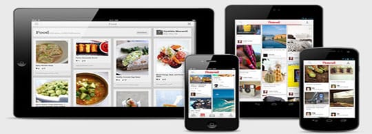
Web designers are creating websites that fit the mobile screen, have standard buttons and functions that are operating throughout the site, the systems, text, images or any other element isn’t overlapping, etc. A responsive web design will be highly predicted when the same site, works in the same way over large screens too.

2) The Application of Original and Better Images Will Grow
 Stock Images are being turned down this year, and new and improved designs are being added to the web designs. People are opting for original and unique images for a website rather than the same old image that has been overused for tons of other pages and wallpapers.
Brand authenticity is highly regarded, and therefore this trend will be spotted way across the designing platform for websites only.
3) There Will Be More Popularity of Customized Typography
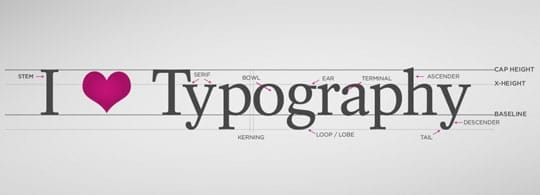
 Designers are opting for customized and bold fonts that match the site, are easily readable and have a sparkling presentation on the site. Designers are working on their own fonts, and even for some companies, this trend is taking the shape of brand identity.
They are keeping the designs minimalistic and focusing on keeping the other trends short. They are layering the images with photography, using simple and basic font colors to make the content appear clearer and sharper for the audience to read and understand.

4) The Use of Illustrations Will Dominate
 The use of Illustrations gives you a unique, cutting edge and an inspiring idea that generally vector images, icons, and photography fail to achieve. This design is kept simple and delivers what the customers are supposed to do or can do and provide them with those features.
The overall layout of the web design takes a completely different shape when you are using illustrations rather than other mediums of visuals to communicate. The entire design feels lighter and more combined, the color scheme and background are also simple, clear and distinctive.
5) The Trend of Animations and GIF’s will Rise
 Websites that use the image rotation and fade in and out techniques are stepping up their games with cinematography, GIF and animation designs. This adds a depth to the entire layout, and your site gets a richer and advanced animated screen that can serve various purposes. Designers are working with UI animations on their sites to give them a more responsive and interactive appearance.
The user engaging trend has been all across the world and designers are working with static imagery to give them a focal point or a meaningful hovering symbol that can tell the users to shop, join or get access to the latest line collection. This trend is categorized as one of the highly responsive and brilliant web design trends.

6) Expect the Increase of Block Tiles and Cards in Web Design
 Inspired by the tiles of Pinterest, these web designs break their content into categories and distribute the data in cards, which is highly responsive and gains immaculate functionality. This provides a quicker view to the site’s content and is a more accessible pattern for the users to click through.
Instead of using the same navigation bar with drop box appearing under them as pointer hovers through them, these provide the content up front and have a far better appearance and presentation than the standard navigation elements.
This article is written by Joseph Carey. He is a Web Developer at Essay Star. He is also associated with blogging for the past many years. His articles are focused on modern web designs, web development trends, and online marketing practices. He gets engaged in surfing, skiing, and scuba diving during the weekend.


