Well, if you think you’ve updated your website to the latest technology and your job is over, think again. After all, just updating the website’s functionality is not what we, as users, expect from you. Design too plays a crucial role. Why not? Isn’t it what we encounter first?
And, if you are still following the design that you used to when you launched years back, you seriously need to pace up. With lots and lots on the plate, you have to incorporate many things into your current design and which might altogether lead to a new digital face of your brand. Wondering what these trends are? Well, here we have for you the top ones on the list. Just get rolling with us here:
1. Growing Popularity of the Animations

Animations undoubtedly make your website interactive and offer the user experience that nothing else ever can. Probably, that’s why they top the list of our web design trends.
Web designers across the industry are using background videos, motion graphics, scrolling effects, micro-interactions, and a lot more to give websites the interactivity they have missed so far. While CSS animations have gained attention from the users, SVG animations have taken web animation to a new height. With this immense popularity, the era of animation is not expected to take a backseat, at least as of now.
Recommended for you: 6 Effective Web Design Tips for Bloggers to Follow.
2. Scrolling- The Innovative Way
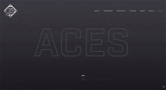
Web designers are really getting inclined to trying various scrolling techniques to offer their customers a new experience. As an example, consider our friends at Aces, who have opted for horizontal scrolling rather than the vertical one. With more and more websites experimenting with the scrolling options, 2019 will undoubtedly see more innovations coming up. Offering users with various scrolling options to stay glued, it will be exhilarating to look at the designers coming up with new ideas and leave the traditional scrolling far behind.
3. Designs with Gradient
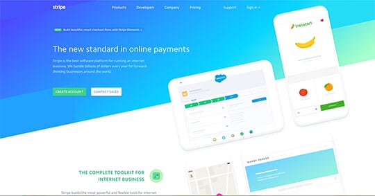
Web designers are one creative streak and for that reason playing with ideas is definitely something that defines them. Gradually blending one color with another, we now have designers add new and in-depth dimensions to their web design. If you are still wondering how it adds value to your designs, have a look at the website of popular payment gateway, Stripe. With intelligent use of colors and gradients, the design really stands out and adds realism to the objects.
4. Interactive Web Designs to Boost User Interactivity

Interactivity and web designs now go hand in hand and not merely as independent elements.
It has been proved that websites with responsive and interactive features offer highly decreased bounce rate. So now, if you are really struggling to keep your users engaged, you know what to do. Some amazing examples of an interactive user interface can be found at Cocainenomics. Such innovative web designs not only exemplify extraordinary visuals but also increase the website’s on-page time and of course, boosts your brand reputation.
5. Detailed Footers to Set Designs Apart
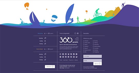
Footer might be the last thing one would consider while checking out overall designs. But not anymore. The section of the website that was merely used for delivering contact information or navigates users to the sign-up page now finds its way to include the most vital information about the page. With intelligent use of elements in the footer space, the website’s bottommost and the ignored area now feels inclusive to the overall web design. An amazing example of this trend can be seen on 360gardalife’s website.
6. Abstract Shapes
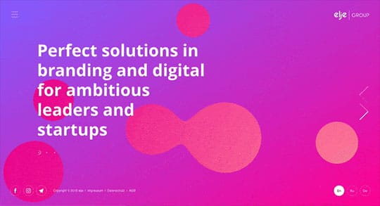
Abstract shapes have received worldwide recognition as something that pleases the user’s eyes. Brands have transitioned towards varied shapes that add an intriguing element to their website. A great example can be seen on the website of the elje group who have smartly combined the features of abstract shapes, graphics, and modern gradient to keep the users engaged.
7. Large Titles to Direct User’s Attention to where It Is Needed
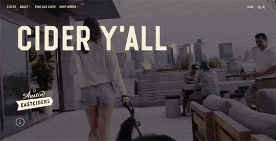
Users are really impatient species whose attention span is decreasing day by day. If you really think you have long enough to keep the users attracted, you are absolutely wrong. At least, when the user’s attention span is as less as 3 seconds. And probably, for this reason, web designers are adopting large, bold designs with short messages to grab user’s attention and speed up the conversion time. Catchy, bold, and large headlines coupled with smaller sub-texts do the work of delivering information like no other.
Austin Eastciders beautifully demonstrates this trend combined with incredible aesthetics.
8. Bright are the New Popular

Well, who does not want the website to gain love-lived popularity? We all do, and the easiest way to ensure this is intelligent use of bright shades. Web designers can combine a well-thought-of flat design with pleasing aesthetics and bright hues to deliver a richer appearance to your digital image.
Choose the gradients that suit you best to make your website appear fresher and leave a unique impression on the users. What else? You can also combine this with “blink” and “Vibrating” options. Something that our friends at Matellio have done:
A Word of Caution:
Make sure you do not overdo the things here, as it is likely to affect your website’s intent. Smartness is the key here.
9. Simple Designs Coupled with Unique Fonts
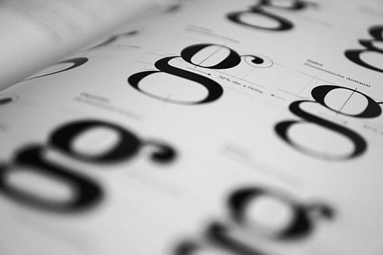
Another way to take user’s attention to the place you need is the combination of minimalistic design and unique fonts. Not only is this combination easier to implement but also makes your website appear richer with a novel way to display information, making it something worth exploring as a trend in the year 2019.
This trend has been best demonstrated by Airbnb who has applied creative and its own ‘Playful’ fonts to unify its look across all the platforms.
Non-standard fonts simply add to the value here by leaving behind the standard fonts. You can also try experimenting with variable fonts to make your website an eye candy for the users.
You may also like: Know the 6 Crucial Tips to Get a Responsive Website Design.
The Key Take Away

Now that we are through to the best of web design trends on your fingertips, it’s time now to give your website a look it deserves. But, don’t forget to keep an eye on more of these. After all, while many are already popular, many of these are still exploring the innovation realm. As much we’d like to assume having an idea of what 2019 has in store for us, we are equally excited to hear out how you contribute to the ingenuity of web design trends 2019.
This article is written by Apoorv Gehlot. He is the Founder of Matellio based in San Jose, CA and runs all client-facing functions and operations for the company. At Matellio, Apoorv is closely involved in architecting and building of the software layer for products owned by Matellio’s customers.


