In the age of smartphones, millennials are constantly consuming increasing amounts of data. Millennials are among the most important and largest consumer segments. When you make a website, and it is not responsive, then you risk losing a lot of business from them. Hence, even before you start worrying about the images and aesthetics of your website, make sure it looks equally good on all screen sizes.
If you have sorted that out, then it’s time to look at the copy of your website, because that will decide the selection of visuals. Make sure your site copy is consistent throughout all pages and conforms to your brand personality. After these two steps, you can start your image search.
Header Image Selection – Be Unconventional
The simplest method is to put a keyword from H1 tag into Google images or any stock images portal. However, this unimaginative approach provides unimpressive, monotonous and conventional image results. To draw any attention, you need to be unconventional in your photo/image selection. Hence, instead of just keywords, read the taglines and understand their central message. Here are some sample taglines (with their suggested images):
Create Amazing Experiences for Your Customers
The tagline talks about ‘experience’. You can list down activities/events where customers are likely to have the best experience of their life. Recreational activities, theme parks, multiplexes, and casinos are some of the places where people usually have a very fulfilling experience. Searching for visuals around such places will give you best results.

Hire a Winning Team for Your Software Development
This one appears to be simple – it’s about a winning team. You will find numerous images of a happy celebrating team with a trophy. However, thinking about the greatest sports movies ever, you will notice that not all winners were born winners. The movies always detail their struggle, efforts, and hard work. Their journey is perhaps more important.
Hence, search for images where a team’s involvement or hard work is represented.

You can observe that we have avoided showing a ‘customer’ or a ‘software team’ in the above two examples to draw attention towards pictures. By using a little imagination and thinking around the taglines, you can also come up with some exciting images for your website.
Get Addicted to Quality
The above tagline is for a page describing quality assurance and testing processes. The page will talk about software testing. However, you can search the entire internet and won’t get any interesting imagery around the topic. On the other hand, if you use the word ‘addiction’ in image search and use it to create a humorous effect.
For more inspiration, you can check out news websites. They hire creatives to write catchy headlines and choose apt (and unconventional) images for their news stories. This can also help you in selecting quality images for your blogs. Here’s an example from HBR’s blog:

Build Trust
There is no doubt that choosing unconventional images draws attention and makes your website stand out. However, you also need to build trust. Using customer testimonials for this purpose is not new, but you need to highlight these testimonials with high-quality photographs and videos (if possible).
Here’s how Chownow does it:

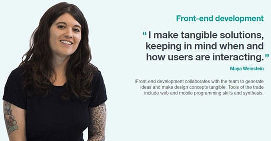
Additionally, people visiting your website might want to know you better. That’s why websites usually have a ‘team’ or ‘management’ section. However, simply placing a photograph with name and designation is unlikely to create a connection that you would want with your potential customers/page visitors. Writing a bio or a quote in the first person along with the photograph might be more impactful. Here’s an example is taken from IBM’s careers page:

Use ‘Looking’ Approach
While images speak more than words, using text along with your images will make your communication more impactful and complete! Placement of text over images is quite common; yet, choosing the right typography and text size is something best left to a designer.
Generally, designers use an overlay to highlight text. But, it’s not necessary.
You can ask your designers to use “looking room” for placement of taglines and CTAs. In frame composition, looking room refers to the space between object/character and the end of the frame. Usually, photographers keep a larger space ahead of a person’s gaze or object orientation. Placing text in this space is highly effective, as people naturally follow the character’s gaze.
Go Minimal
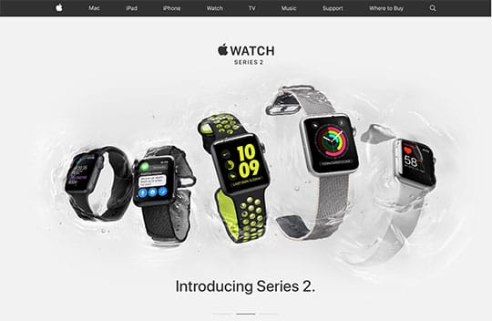
Nothing much to say here, just like too much of text is avoidable, too many images can also put off a website visitor. A good designer will make use of white space. You can check out Apple’s website to take some inspiration:

Use Humor
Humor has always been a part of marketing – it’s the easiest way to connect with your audience. Most marketing campaigns use this emotion to varying degrees. There’s entire range to explore; from slapstick to sarcastic and dark to smart humor. If you can accommodate humor in your website copy and designs, there’s nothing like it. Images supporting funny taglines create an instant connect.
You can browse numerous magazine advertisements on Lurzer’s Archive for getting cool ideas for your website banners.

Get a Professional’s Help Before Uploading
Do you remember the vivid warm colors of Amélie? What about the iconic blue used in Matrix? Matrix and Amélie would have looked terrible without their unique color grades.Color grading can also make a whole lot of difference to ordinary looking images. It is important that before you upload new images to your website, your designer makes them suit your site color palette. There are other technical jobs like compression, cropping, and resizing which might require professional help. Further, you might need different versions of images for ensuring responsiveness.
Don’t Forget the CTA
It sometimes happens that the advertisement is so good that you fail to recall the actual product or service it was made for. With all this talk about the selection of images, ensure that they do not overwhelm your product or service offering. Keep your calls to action handy.
This article is written by Kunjal Panchal. She is a Digital Strategist and a social media geek. She is passionate about content marketing and strongly believes in the power of storytelling for marketing. A perfect day for her consists of reading her favorite author with a hot cuppa coffee. Find her on Twitter and LinkedIn.


