We can clearly see that in 2021 there were several logos rebrands, which means that the world does not standstill. In 2022 we will probably be offered some unique and amazing logo design trends.
We can say that the logo is the face of the brand, and it forms its identity. And it is no secret that logo design is probably one of the most valuable brand assets. Creating some unique ideas as well as logo design concepts is quite a difficult task and requires a lot of time and diligence. When a designer wants to develop a logo that can become iconic and instantly recognizable, it becomes a real challenge.
However, if you are just starting out as a designer or if you want to get a logo for the brand as soon as possible, then everything is much easier. And now we will break down the main trends in logo design in 2022. Let’s begin!
A Little Bit About Logos
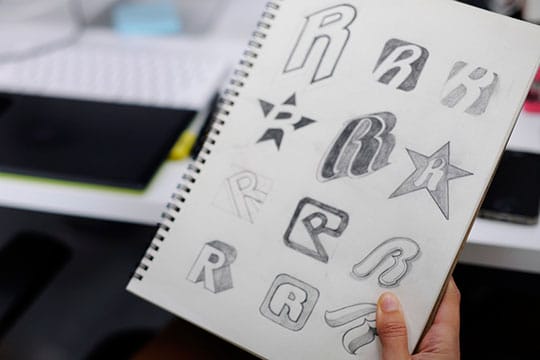
Practice shows that today a lot of CEOs order the development of the logo from a specialist, and do not even understand what this concept is actually about, and generally don’t want to waste time on it and go into details. Opinions vary on this subject and many simply cannot even define what a logo is. For example, some argue that it is a just image, while others are absolutely certain that it is simply the same as a brand name.
So, let’s clarify what a logo is, so there are no wrong conjectures or questions without answers on the subject:
- individual graphic image (mark).
- font layout of the mark.
- combination of image and caption.
Now it is clear to us that the main task of the logo is a kind of communication with the consumer and the idea of the company. So, let’s understand what will be special and helpful for us the latest trends in this area.
Recommended for you: 13 Best Graphic Design Software for Windows (Free and Paid).
Minimalism
Laconic design with simple lines and the absence of superfluous details “shot” a few years ago and is still relevant today. This is mainly due to the digitalization of business. The fact is that a logo designed in the style of minimalism looks good and is easily recognized in any size: whether it is a tiny icon in a messenger or an avatar in a social network.
To show the maximum advantage of the minimalist style, you need to think in detail about colors, space, and fonts in the logo. The designer should tell more while showing less in the logo design. In this way, specialists usually simplify the image as much as possible and minimize those elements that do not have a proper impact on people, and sometimes just distract attention. Despite the fact that minimalism is quite a difficult trend to develop, it remains one of the most effective techniques. Here the designer can completely and effectively realize its originality and vision.
Today, minimalist design is widely used by companies such as Apple, Uber, and Google. With a greater impact not only on overall aesthetics but also on functionality, minimalist styling is predicted to be one of the leading trends in logo design.
Gradients

Gradients in branding have been a sought-after trend for several years. There is an easy explanation for this. Designer software is constantly evolving, and today’s specialists have many opportunities to work with new shades. Therefore, it is now realistic to create great color transitions.
If the trend is already in demand, what can it surprise in 2022? Designers are expected to expand the range of colors and use different ways of applying gradients. Specialists will more often use methods of reducing or increasing the saturation of the selected shade, switching between colors.
Gradient gives the opportunity to create an original visual solution, to increase the uniqueness of the logo or successfully update it. Plus, the brand symbol can become more voluminous. And successfully chosen colors will form a special perception of the identity.
Simplicity
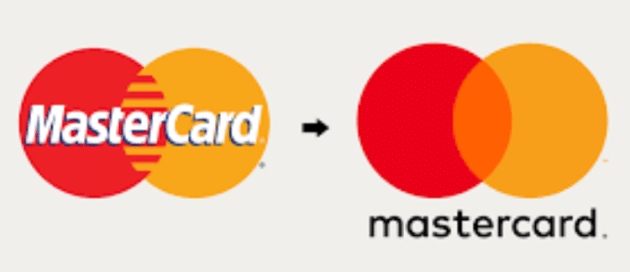
Simple shapes may well be one of the hottest and most important logos design trends. It is also a perfect way for implementing many styles. Simplicity’s success depends on the following factors: practicality, convenience, and aesthetics. This design never goes out of style, due to the fact that customers like logos that they can easily recognize and remember. And brand promotion is all about remembering.
Thus, it becomes clear to us that simplicity and consistency is the key to success in this case. It is important for the designer to correctly highlight the necessary information and put emphasis on it. And then the brand can get an attractive and simple design.
Another awesome benefit of this tendency is that you give the viewer a break and not overload his or her vision. Today there is too much unnecessary and superfluous around us, so by using a simple logo, we soften these conditions. What is more, there is a good chance that professionals will focus on creating clean and beautiful images, eliminating all the unimportant elements that are not necessary for the brand image.
It is also expected that the simple forms will provide primary and unique brand logo forms as well and help develop brand imagery more easily for different websites or companies. This is the main reason that in 2022 there will be many aesthetic and simple logos competing with each other to attract the customers’ interest.
You may like: SEO and Web Design: How to Make Sure They Go Hand in Hand?
Hand-Drawn Logo
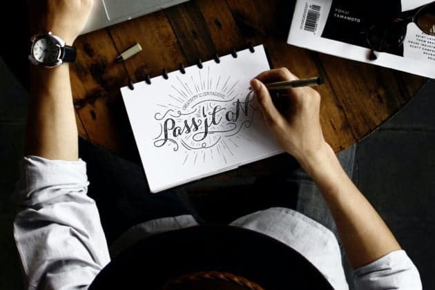
Another breakthrough in the design of logos in 2022 maybe the concept of hand-drawn logos. The trick is that in this design you can express the values and personality of the brand with maximum creative freedom in the most precise ways. Undoubtedly, hand-drawn elements bring a human and personal touch to the brand logo design.
Such logos will be very appealing to customers, given that more and more designers have been improving their drawing skills lately, creating truly unique ideas and concepts. The appeal of hand-painted logos is that we can appreciate the smallest details, which enables us to emphasize originality. This method is unique and gives the logo design a sense of reality. One of the best ways to start this type of logo design is with just a pencil and paper. Sketching gives the designer the freedom and flow of ideas that he or she can put right out of his or her head on paper.
Negative space
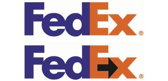
This technique has been used for quite a long time. It is successfully used by specialists all over the world when creating brand identity. The interesting thing is that the trend does not lose relevance, being the most stable in the sphere of design.
It is possible to create negative space by various methods. For example, with the help of intersections, the effect of ambiguity, and the removal of some elements of letters.
It is important to ensure that the effect is not immediately noticeable. Logos with negative space are complex. They attract attention, but you can “unravel” them only after careful consideration. During this time, a person will perfectly remember the brand symbol and perhaps feel some connection with the brand.
At a basic level, the negative space outlines the limits of the positive, works for brand recognition, and popularizes its symbols.
The ’90s Never Get Old

The corporate style of 30 years ago has been safely forgotten. But not forever, because fashion is cyclical. Thus, it was only a matter of time before the interest in this design started. It is expected that in 2022, the most interesting logo from the ’90s will be adopted by modern designers.
Here we are talking about a contrasting gradient, which uses saturated, bright, and almost incongruous shades. Also, smooth lines and fonts with a hand-drawn effect may be applied in this style. If you use these ideas correctly, the result will be interesting and noticeable, especially if your competitors prefer laconic classics in the style.
Complex Parts
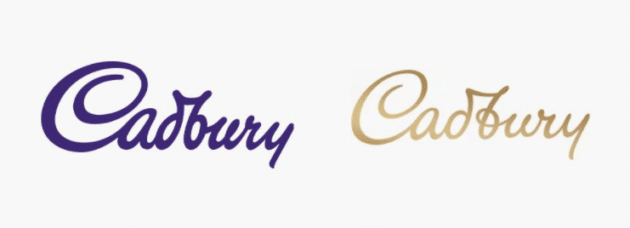
This trend in logo design is a new look at visual elements after a long period of minimalism. We are talking about logos with complex details.
New elements have been added to linear logos in the form of many different lines, color variations, fonts, and other small details that come together.
It may take a lot of time and effort to create a logo in this style, but the result is likely to surprise you. You will get a work of art. It is more than just a logo. The gorgeous ornate design is usable for any purpose and in any size; it will always draw the interest of the audience.
You may also like: Ready to Redesign Your Logo? Here’s How Big Brands Did It.
Final Words

And so, now we can draw some conclusions based on our little research. The new trends of logo design lead us to the fact that they will be minimalistic and consist of simple shapes but will remain colorful. But they will not be without gradients, old-style, or other bold solutions.
Logos have a very long lifespan. They can be used for decades and do not need to be changed. But sooner or later, the time comes when companies do update their logos. Logo design trends in 2022 are changing, losing their effectiveness, from geometry to color schemes. It is advisable to stay on top of the changes. Because, the success of your company, brand, profits, and recognition will depend on the right logo design.
This article is written by Liza Koenhoven. Liza is the CMO and copywriter at Masterbundles, passionate about black coffee, writing, and Depeche Mode. She does her best to deliver you the most valuable deals on the web. You can follow her on Facebook.


