As users, we visit plenty of websites each day, and businesses here need to show some extraordinary creativity to attract users. Startups focus on some excellent visual appeals and utility of web solutions to make users stay here for a more extended period. Hence, keeping an eye on the latest and trending UI design patterns is essential to remaining at the top.
These UI trends not only focus on satisfying user’s requirements but also on providing them with significant security levels. A great combination of these trends would persist in the long run while keeping the users happy and the businesses successful.
Let us now talk about the hottest and latest trends in UI design patterns you should pay attention to:
Minimalism
Minimalism’s power in UI design stands proudly and is not going to lose its persona so quickly. Every day individuals see so many advertisements that have discount notifications. Consumers communicate with several rich interfaces to avoid pressure, and web designers are always searching for something fresh and exciting to make the graphics simpler and more accessible. They limit the total amount of colors while trying out different compositions.
Recommended for you: When Should You Consider Redesigning Your Online eCommerce Website?
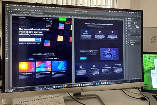
Dark Mode
Dark mode has become one of the best benchmark trends that designers should look forward to. Many leading brands are offering dark mode as themes like Instagram, Apple, and Android as well.
Reasons why dark mode is hot?
- It is modern, sleek, and classic in appearance.
- The dark background highlights other design systems and elements.
- It’s easier for low-light conditions.
- It saves battery power for OLED AND AMOLED screen types.
Also, in most applications, users can choose to activate dark themes whenever they need.
3D Animation and Graphics
There has been a high evolution in 3D graphics in both mobile and web interfaces in recent years. However, many designers have moved from dynamic images to 3D animations to make the app screens and websites look even more creative and engaging. Creating such graphics is very challenging as it requires high skills and a creative mind. It is also very time-consuming. But it’s worth every pain.
3D designs are always beautiful, and users never pass by without observing them. 3D images have flexibility in them. They look realistic, which is a great advantage for users. 3D graphics can save your name in case the photo content gets expensive for you sometimes. On the other hand, designers always have space for experiments.
Ink Trap Fonts
As a designer, if you want to get along with some new kind of typography, then the ink trap font is the best and is trending vastly. Ink trap is nothing but a specific type of typeface that is used in small size printing. The detailing and the corners are removed.
Ink traps are essential as, without this, the excess ink will soak and ruin the edges. Initially, ink traps were designed for printing on small point sizes, but today we can see the exact opposite visual. We can find the oversized bold version of these fonts on some popular websites, which adds some more charm and creativity to it.
Voice User Interface (VUI)

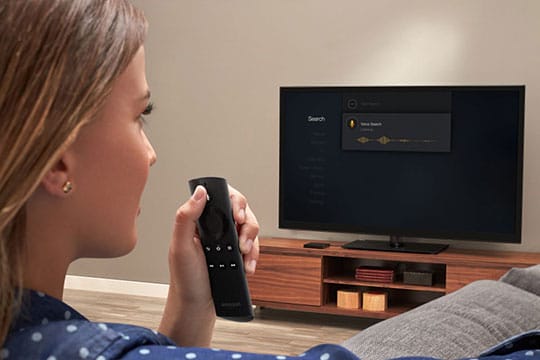
Communication via Voice User Interface (VUI) is one of the finest trends in UI and UX design patterns that are ruling the web right now. Today, designers are trying to cope up with the upcoming latest technologies and trends that provide users with a voice interface in common.
For instance, today, we see several apps where we can translate sentences and words into other languages. It works when you tap a button, and the device starts recording your voice and summarizing your speech. In this manner, you can easily interact with people who speak some other language. One best example of a Voice user interface is Google Translate.
Glassmorphism

Last year neomorphism was highly used in web designing practices. It highlights a combination of some common approaches to creating a better user experience. In 2021, web designers got a new toy which is known as glassmorphism. This trend originates from the blur effect or blurred background. When users look at such elements, it seems that they are looking at them through a glass.
Split Screens
The trend of split screens and pages hold great significance in recent years. The trend tends to be super effective as it opens up the areas for color combinations. Split screens are useful if you need to show the differences or equality.
Asymmetric Grids

Experiment with grids never stopped by. Asymmetric or broken grids are the best options available right now. Doing this requires creativity which additionally requires deep research and testing.
Pastel Colors
Since today simple web designing and minimalism are taking over the web, designers are using pastel colors in their designs. In this way, they highlight the meek and lightness of the design. Such pretty are the colors that they fit into various concepts very easily. They also coordinate with the right atmosphere for several websites, for instance, E-commerce platforms.
Icons

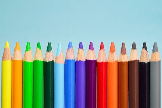
Icons are an excellent tool for interacting visually with customers. Plain icons are considered a robust trend in UI design patterns. Icons are the only tools that have the ability to convey information in less space. Due to this reason, many companies are giving special mentions to icons.
2D Illustrations

Illustrations stay on the top of the user trends. Earlier, web designers bonded with minimalism when it came to designs. In this manner, they tried to make the web pages less overloaded for users. But now, web designers are trying out unusual design angles. They are using pastel or bright colors by which the illustrations are getting fancier and causing some big effects. Design experts recommend using SVG format for your designs.
You may like: UI vs UX Design: The Difference in User Interface & in User Experience.
Artificial Intelligence (AI)
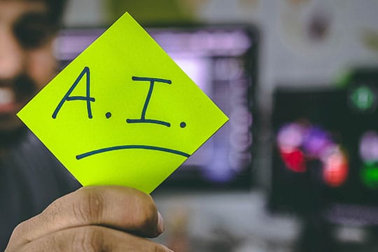
AI or artificial intelligence is amalgamated in almost every other product. It is doubtful that it will ever be able to replace the designers. On the awkward side, it will continue benefitting us. A famous example is Google’s AI-powered smart reply that does the job well by producing perfect replies which is a big time saver especially if you use English the replies are well separated to their contrasts with their environment.
Due to AI, products are going to learn much more about user’s behavior, which would help to create a better experience in the future. This will create a higher conversion rate.
Retro Aesthetic
For this, you need to go back to the ’80s with bold typography in your mind and come back with pastel colors of 2021’s UI in the ’90s. You need to be creative here and create retro yet aesthetic looking designs.
Onboarding

It is a short presentation of the product that helps you get an idea of the application. It makes it easier for you to understand the main functions. However the case may be, onboarding has become very important in the UX trend that designers can never ignore.
Onboarding is unreal and contains some most important displays of mobile applications. Settling for them, users can get a much sophisticated idea of what a particular application can do. We recommend keeping the onboarding thing very simple. Remember to pay close heed to the fonts and make them easier to read and study. Use high-resolution photos and graphics, as you need to facilitate your product to the users.
Low-key Gradients

Normal design trends are moving towards automation and have everything that designers need. The elements are distributed in such a way that they are making their way ahead. One of these is the sophistication in colors and simplification. The whole idea is to automate things smartly that brings light to the website.
Surreal Photographs

Realistic product photographs can grab enough of your attention. People nowadays look for such type of photos that would make them stop and stare. The addition of such elements is out of the box and super trending nowadays. Popular brands are using this strategy and gaining huge success overnight.
Air Gesture Control
Air gesture control is one of the important patterns in a UI design elements that will definitely dominate designing in 2021. It improves user experience significantly. With the introduction of touch screens, various gesture controls have taken their spot. But all this is done by touch controls. But, now it’s getting replaced by air gestures, where a hand movement in the air can make things work on your phone. Isn’t it interesting?
Fullscreen Visuals

Fullscreen visuals are now capturing the attention of the users. It has been found out that things in the center of any website attract customers in the best manner. Moreover, this trend has already started to gain prominence and will gain even more spotlight in 2021.
You may also like: 10 Design Trends You Must Implement in Your Mobile App in 2021.
Final Thoughts

In 2021, design systems and trends are a mixture of simple UI and UX patterns, pastel colors, bold typography, minimalism, and 3D visuals. Hence, to succeed in creating a better user experience you need to choose the best combinations available. We believe that UI focuses on achieving the user’s goals. And for this, keeping an eye on the latest trends is very essential.


