In this digital day and age, your web presence can directly affect your bottom line. Your website not only needs to send the right message, but it also needs to make sure that the message is actually heard.
Appeasing the ever-changing Google algorithm has never been easy. If you’ve been trying to overcome it with your best SEO efforts but the results are still lackluster, there may be an element missing: which is the cooperation of your web design.
While SEO and web design are usually regarded as separate entities, separating these two closely related fields will make it hard for either of them to reach its full potential. How to remedy this situation? Here are a few tips that will help you make sure that your SEO and web design always go hand in hand and only aid each other’s efforts.
The importance of SEO-friendly web design

Web designers may not always be operating with regard to the rules of the SEO world. An imbalance where web design is prioritized over SEO might create a website that will wow visitors—but your chances at getting visitors will be minimized as you get buried under other, better-optimized Google search results. On the other hand, an imbalance where SEO is prioritized to the detriment of web design might create a perfectly optimized web page that ultimately fails to grab attention and confuses visitors due to a poor layout or outdated look.
Both SEO and web design have the same goal: to bring visitors and make them stay. And the most effective way to do that is with the collaboration of these two departments.
Recommended for you: How to Improve Social Signals of Your Website for SEO?
Optimization for better loading speed

A 2016 report says that if you are targeting mobile users, your website needs to load in 3 seconds, or else, you’ll lose over half of your potential leads. Note, that since then, the demands of customers have only grown. A website’s loading speed is in direct correlation with its bounce rate, a factor that will have an adverse effect on your search engine ranking if the number climbs too high.
If you cannot achieve that ideal 3-second threshold, the faster you can make your site, the better. Even if interested visitors will not immediately be sent on their way when met with a slow-loading site, continuously having to wait for pages to load will ruin their user experience—which is another factor held in high regard by Google’s algorithm.
So, for good SEO results, it is clear that web design needs to do its part in this matter and possibly make some compromises. For instance, large pictures, animations, sliders, and other fancy elements might need to be compressed, further optimized, or sometimes even removed so that they don’t weigh too heavily on the loading time.
Remember that elements don’t always have to be removed in order to maintain the impression that the website is loaded. In that case, preventing the shifting of content and using blurry placeholder images will be of great help in maintaining high user experience levels.
Mobile-friendliness is paramount

According to statistics, search engine visits conducted from mobile devices now make up over 60% of all search engine visits in the US. This trend has been on an upwards curve for years now, as Google already indicated that the general internet traffic accounted for mobile devices had already stepped over the 50% mark back in 2016, too. As if that wasn’t enough, mobile-friendliness is a ranking factor in itself on Google. This clearly gives a very good reason to all businesses to cater to that large percentage of traffic that is to come from mobile users.
The issue with websites that are not optimized for mobile is not only that they take longer to load. The significant screen size difference will destroy any effect the website designer intended to achieve, and the site may even be rendered virtually dysfunctional as CTAs become too small to press or even to see.
Now, mobile sites are almost a thing of the past. They can even interfere with your SEO rankings due to duplicating content, so they are out of the question in 2022. Instead, businesses should focus on responsive design. Designing a website that will be able to adapt to any screen size is what Google prefers the most. Thus, designers must have mobile screens at the forefront of their minds during the design process.
Readability is not just a question of design

The next important way in which design and SEO are closely intertwined is readability on the page. What you need to understand is that few people will dive straight into reading what you have to say. Most people will first scan the page and if they cannot do that in the blink of an eye, they will hardly stick around.
Readability is not just picking a web-safe font that everyone will be able to read with ease, though, that is certainly crucial. The size of the font also needs to be taken into consideration with regard to the expected screen sizes. How the text is broken up across the page also highly affects how digestible the information will look to visitors. Web designers need to account for this with a layout that allows for both short and long texts, so the page doesn’t look awkward in either case. Flexibility is a keyword in an SEO-friendly design.
Site organization for better UX

A poor loading speed is not the only reason a visitor may decide to bounce immediately from your website. In fact, problems with the website’s layout are also high up on the list of possible reasons. A website’s design must never evoke confusion. The architecture must be organized for the best possible user experience. Clear and simple navigation, for instance, not only appeals to your visitors, sparing them from frustration as they click through all the categories just to find the one thing they need. It also makes the job of Google’s crawlers easier.
Certain navigation menus can never fulfill this criterion of simplicity and while designers may favor them, they won’t benefit your SEO efforts. For instance, designers should steer clear of mega menus, hamburger menus, and accordions so as not to work against SEO.
You may like: Trending Responsive Web Design Frameworks in 2021.
Building trust and authority

Visitors seek out websites with a purpose. Whether it is to find out the answer to a question or to explore a topic of their interest, they don’t want to waste their time on content that may not follow high standards. As we already mentioned, visitors will decide whether they will give your content a chance based on their first impression of your site.
If the look of the website fails to send a strong message of trustworthiness, customers will not hesitate to click on the next search result. The perceived trustworthiness of your website thus depends equally on its design and its content. Great content needs to be presented in a suitable manner in order to perform well.
High-quality content does not only mean well-written articles, though. Your content also needs to be interesting and engaging while taking into account the potential background knowledge of the visitor. For instance, stuffing your blog post with industry jargon might show that you know what you’re talking about, but it will hardly hold the attention of a visitor who’s not as deep into the topic as you.
At the same time, the content needs to cater to search engine robots as well, with the appropriate density of keywords, text length, etc. It is possible that old content on your site needs to be reworked to fit into this profile, but a reliable SEO agency with plenty of experience will be able to tell you that at a glance.
Engaging visitors

By now, you can already tell that engaging the attention of your visitors is how you will make them stay and send Google the message that your website is worth placing high on the search results list. Improving the readability and publishing easily approachable, interesting content are ways to boost engagement. However, web design has a lot more potential to be of aid here.
Humans are naturally highly visual, and their eyes will linger longer on something that is visually interesting. Web designers can take advantage of this fact; they can keep visitors longer by using the right colors and right graphics to make content more engaging.
At all times, designers should keep in mind that simplicity is key for an SEO-friendly result, though. As already exemplified earlier on multiple occasions, in certain cases, less is more. Just like a simple, easily readable font will perform way better than any ornate one that may look more eye-catching; there are certain limits that your overall design should not overstep. The task of creating an interesting but simple design might be a challenge but it’s the best approach out there.
Place scripts outside of the HTML document

Did you know that how you write code is an essential consideration when it comes to web design and SEO? As a priority, ensure that your JavaScript and CSS are externalized when you are coding your site. The reason for this is that search engines now explore what is inside of your HTML document.
If you have not used an externalized approach for JavaScript and CSS, then what can occur is that a host of lines of code can be placed in front of your actual content which is designed to attract users. As a result, the bots that crawl your site are slowed when searching for those keywords as they have to first run through the code that has been placed ahead of it. It simply makes crawling slower and deems your site slightly less relevant than it actually is.
It is important to consider that search engines like their bots to be able to unearth the critical content as quickly as possible. So, if your JavaScript and CSS are not externalized, then your site’s web design for SEO is not optimized.
High-quality content

These days the quality of your content really matters more than ever. As previously mentioned, keyword stuffing is well and truly a thing of the past. Now there are three concepts that you must embrace when considering your content strategy for your website.
The first is relevance. How relevant is your content to the needs and requirements of your users? Especially, in consideration of the searches that they run for your type of service? It makes sense, as a financial business wouldn’t put up blog posts related to food for example. Not unless there was some kind of relevant theme that they were running with that pertains to their core users. So, always make sure that the content you are posting has relevance and use to your audience.
Secondly, ensure you employ an approach that embraces variety. Simply posting up the same kind of content doesn’t work as a social media approach. It doesn’t appeal to search engine bots which instead see variety as a netter hallmark of quality. And there is no excuse for not putting up a nice mix of content either. There are so many options and easy ways to create it. From images and videos to blog posts, infographics, and interviews, just to start off. As long as your content is always relevant to your userbase in some way, then variety s always king.
Finally, ensure that your content remains fresh. Something that is aging will simply not have the same effect on search engine bots. So, smart web design for SEO means constantly repacking old, relevant content as well as hunting down and posting new content that keeps bots and users interested in your website.
Recommended for you: 10 Excellent Content Writing & Analysis Tools for SEO Blog Writers.
Image optimization and Alt attributes

Image optimization is a central tenet of web design. Images that are too big will slow down your loading speeds. It also takes away from the aesthetic friendliness of your site. Make sure that you shrink files sizes down. But other ways in which you can optimize include the font that you use, the relevancy of your images to your content approach, the colors that you use (both from a visual perspective and from a branding one), and then the symmetry and shapes that you use in order to give a pleasing user experience.
It is also of paramount importance that your alt attributes are descriptive too. That’s because search engines actually explore your alt attributes. They apply them for relevancy purposes. So, it is better to have no alt attribute than to have one which was totally irrelevant to your site. It is also important to make sure that your alt text is W3C compliant too (more of which later). From a practical perspective, alt attributes exist to help those users who cannot see your images. So it’s just smart and considerate customer focus to use alt attributes that are relevant and descriptive.
Use unique metadata
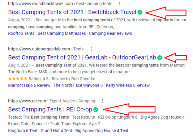
In terms of your metadata, it is not vital that the keywords that you use in the titles of your pages, as well as descriptions, are relevant but also different. It’s an easy mistake to make when building a site that designers forget to change the metadata. They end up using a standardized template. That’s a bit of a disaster in terms of the bots understanding the structure of your site. We have already seen this as a key consideration in search engine rankings. To maximize your web design for SEO, ensure that all page metadata is unique and relevant to the page itself.
Follow W3C standards

In the early days of the internet, things were a bit of a mess. That’s because nothing was standardized; there were even a number of different browsing platforms that were not even compatible. This means any number of sites were unable to be opened on the browser you were using at the time.
As a response to the growing need for standardized procedures, the World Wide Web Consortium came about in 1994. It sought to develop a number of standardized protocols that will facilitate the growth and user-friendliness of the internet. As a consequence, a number of best practices have been adopted in terms of coding and website design. This is for user privacy, security, and browser compatibility.
All of these things have helped to make the internet a place that anyone can access (outside of governmental controls). This has ensured high standards in terms of how websites are built. From this perspective, it is vital that your web design for SEO factors in all of the relevant W3C standards. Adheres to them as closely as possible to ensure that you satisfy all of the requirements that are search engines have in terms of sites that are deemed acceptable and relevant to users.
Use proper heading tags
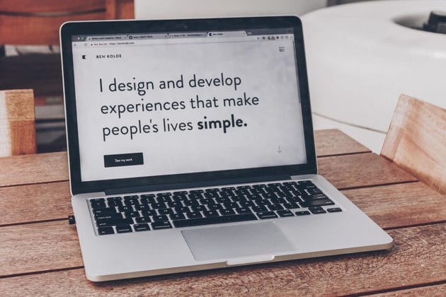
Heading tags are another aspect of your website’s design that is relevant to the search engines. Because they provide details as to how your HTML document is structured. It is also because these tags are considered more valuable by the bots than almost anything else on your page, with the exception of hyperlinks. It is therefore essential that you use the standardized HTML heading hierarchy. Use H1 for the page, H2 for the blocks, H3 subheadings for elements within the block, and so on.
URL Organization
To have an SEO-friendly site, it is critical to have a clear URL formation. This is because search engines have a preference for unambiguous URLs. For example, if someone is looking for a bakery in New York, they would rather click:
https://www.companyname.com/bakery-new-yorkthan an unclear URL like:
https://www.companyname.com/post-id-44930284Google does not rate a link that is not user-friendly as valuable.
Printer-Friendly

A printer-friendly website gives visitors freedom of choice and therefore a good experience. Some users would prefer to print the page for further reading, reviewing, archiving or a more leisurely reading experience.
For this reason, ensure your text is legible, the font is not too light or too thick when printed. Make sure that no blank pages or irritating popups end up printed. CSS makes it possible to have the whole web page printed without any hassle. Finally, good content sells any day. Quality content will engage your reader enough for them to print.
You may also like: Design Tricks to Elevate Your Content Quality.
Conclusion

Web design has increased in complexity only in that there are many more relevant details to now take into consideration. All in all, it’s a very good thing. It ensures that users truly get access to the most relevant information. It also ensures that the websites themselves improve in visibility depending on their real relevance. This is not their adherence to a number of old tricks, as existed before.
The vital consideration is that web designers possess this relevant knowledge in order to apply it to their website designs; they work in conjunction with these practices to build the very best websites.
If content and form fail to cooperate, neither will be able to reach its full potential. If the two departments of SEO and web design manage to work together, though, both will be able to achieve better results together than in isolation.
We have written this article in association with Jacob Braun, Ellie Coverdale, and Derek Iwasiuk.


Jacob Braun is a writer and a fan of most things online. He is curretly associated with Green Web Marketing. He writes about web design and development, digital and traditional marketing, small businesses, social media-related subjects, and most things revolving around the entertainment industry. You can follow him on Twitter.


Ellie Coverdale is a marketing writer at Boomessays.com. In her role, she loves sharing her wealth of knowledge on topics like marketing and business. She has also been involved in tech research projects from which she has drawn a lot of expertise.


Derek Iwasiuk runs a national digital search engine optimization firm Engage the Crowd headquartered in Minneapolis. He also spends a lot of his free time educating the minds of thousands of top agencies and young SEO San Francisco experts. You can also follow him on Twitter.
 Jacob Braun is a writer and a fan of most things online. He is curretly associated with


