ECommerce has been the buzzword for the entrepreneurs for a while. With the global phenomenon such as amazon, eBay and countless other regional eCommerce stores out there, the consumers have numerous alternatives to pick from. Faulty designs and poor user experiences of the website are the two most common contributing factors when it comes to failed eCommerce businesses. Often, the entrepreneurs fail to recognize the importance of creating a seamless buying experience. In this post, we’re going to discuss the top 7 designing tips to increase your eCommerce site conversion.
1. Check the Shopping Cart

Customers want to have the peace of mind whenever they decide to make an online purchase, and if they can easily add an item to their shopping cart, they’ll feel at ease knowing that the item they want is available for sale. That said, it’s important for a store to have a specific area where all items of the buyer are listed and other important information are also included. Also, a visible and readily available checkout is also a great way to move from the shopping into finalizing the purchase. It doesn’t matter what page the customer finished his shopping; what’s important is that he can easily link back to the main page.
Likewise, aside from having a shopping cart information within the page, it should also be easier to find. As much as possible, use contrasting colors from the color scheme on the rest of the page so that the shopping cart would stand out.
2. Utilize the Autocomplete Function

A search box is crucial for an eCommerce website because this gives the visitors the privilege of being able to access the products that match their needs. More than 20% of online visitors would rather use the search engine feature of a website, than going through several categories just to find out what they’re looking for.
There will be instances where the searches would yield more results than what you expected it to be. This is where the “autocomplete” feature becomes quite helpful. Just like what has been mentioned earlier, it offers the closest match to the products the customers are looking for. Likewise, the search suggestions give visitors the opportunity to correct the search results in case these don’t match or directly link to the products.
3. Make the Product Images Extra Appealing

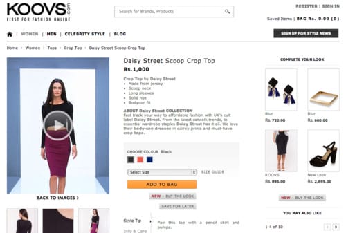
When designing an eCommerce website, it’s very important that you also focus on this important factor. Product images are the most vital part of the customer experience. We all want to see the item first before we decide that we’re going to buy it. This is why it’s crucial to let your customers see the products because they cannot check them physically. That’s why it’s highly advisable to put images on the website, as a way to attract visitors into purchasing an item or two. A smart way to display product is to highlight the key products separately, the way Kandypens does with their signature products.
4. Show the Product Availability as Clearly as Possible

For popular online stores, there’s no doubt that the inventory levels keep on changing every now and then. Visitors have the habit of taking the time to compare several products before they decide to make a purchase. That’s why it can be quite frustrating if the product they’re eying on is already out of stock– even when they have just added it to the cart. This would definitely lead to a loss of the customer. Don’t leave your customers dissatisfied, make sure customers clearly understand which products are available. Make sure your catalog is designed to be coherent with real-time inventory status.
5. Be Unique

It doesn’t matter what type of website you’re dealing with, if you’re a business owner, you have to know that it’s important to be original and unique. If you can’t make everything about your business unique, then you can probably make some elements unique. The original features of a website are what customers would always remember. Unique designs & brand elements help the customers to remember your eCommerce site for recurring purchases and recommendations.
6. Offer a Quick Product Overview

A quick product overview can be helpful to customers as they can conveniently scan the catalog and look for items that they want to purchase. Aside from that, it also allows the users to browse several products all at once without the need to go from one page to another.
7. Don’t Forget the Final Cost
Lastly, it’s important that the final bill would be shown on the last page of the shopping cart. Customers don’t want to be surprised by extra charges, and that’s why you should be presenting their invoice where the delivery fees and taxes are already included.


