From short calls-to-action to images, videos, and overall design, optimizing content is vital to improve user experience.
A website may increase its conversion rate, reduce bounce rate, and prolong user sessions by providing high-quality content. However, optimizing website design involves many aspects. Thus, it may be challenging to take the first step.
To help you get started, this article will cover seven design tricks to elevate your content quality. Let’s dive right in.
1. Make Use of White Space

A minimalist design helps set visitors’ focus on a site’s essential parts. Having a lot of white space makes an image or a sidebar stand out. The same goes for written content. This design style of your content lets visitors skim an article with ease, as it minimizes distractions.
WordPress has dozens of free minimalist themes in its directory. However, it may need a little coding to adjust the white space to cater to your site’s needs.
Utilizing a drag-and-drop builder, like Zyro, is an excellent solution, as the platform lets users customize their sites without coding. To get the perfect amount of white space, all they need is to move around each of the template’s elements.
Many website builders offer designer-made templates that can be modified for any line of business. Instead of building a website from scratch, it saves you time and effort. It’s much applicable for non-technical people, those who never made a website before.
Recommended for you: The Usefulness of Content Marketing and Content Strategy.
2. Use Optimized Images

The use of visual aids on a website is crucial to keep visitors engaged. However, under-optimized media files can harm a site’s user experience. Other than improving overall website quality, pictures complete the user experience, eliminating bounce rates and converting leads better.
Displaying pixelated images makes a website look less professional. On the other hand, excessively large multimedia files may slow a website down or fail to render in case of poor internet connection.
For the above reasons, image optimization is vital to keep an excellent site performance.
One of the best practices is to keep all of the media files under 2 MB. If the image size you’re going to upload is larger than that, use a lossless compression tool like Kraken.io to reduce the size without losing quality.
Additionally, using carousels can harm your website’s performance. It might attract visitors’ attention to look at the first slide, but then they will be less interested in taking further actions. Moreover, carousels will also affect the speed of the page to load which will also affect the website ranking.
3. Keep Colors Consistent
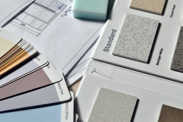
Colors can convey emotions, messages, and experiences, which makes them a crucial branding element. For example, the color red illustrates passion and excitement, whereas blue portrays dependability and security.
When used on a website, colors often determine site visitors’ first impressions. They can either encourage or discourage first-time visitors’ to engage with your website.
Let’s look at these handy tips for choosing the perfect color combo for a website:
- Consider your brand’s personality. Site owners should think about the overall vibe of their products or services. This helps determine the best primary color for their website.
- Keep the combination simple. Five colors should be enough to create a unique color palette. A complicated color scheme may confuse site visitors. Also, don’t forget to choose one or two focal colors to highlight important information.
- Utilize different shades of the same color. It helps visitors recognize a brand more quickly, solidifying its identity.
A color palette generator, like Muzli Colors, can help generate beautiful color schemes in an instant. All users have to do is type the color name in the search bar and click Enter.
4. Create Compelling Calls-to-Action

Calls-to-action is elements that prompt visitors to take immediate action, such as a button or link. As they affect conversion rates, they’re among the most crucial parts of a website as they could help increase sales and leads for your website.
Choosing the right call-to-action should be adjusted to the kind of web page and its content. The correct strategy will gain more clicks to the page. Some examples of CTA include Create an Account and Add to Cart buttons. Here are several tips to make your CTA stand out:
- Take advantage of bold colors. This strategy helps separate a CTA from the rest of the web page’s content.
- Use strong action words. Commands are the best structure for a CTA. Phrases like Subscribe to Our Newsletter or Download the eBook encourage site visitors to take the desired action.
- Create a sense of urgency. Time limits can be a content marketer’s best friend. Instead of using Get Your Free Trial on a CTA, Get Your Free Trial Today encourages people to click, yielding better results.
You may like: What Comes First: Website Content or Website Design?
5. Pay Attention to Content Structure
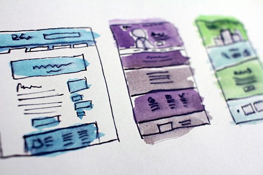
Content structure relates to how an article is organized. Its main elements consist of the article’s title, headings, and category. They help establish a hierarchy among the topics and improve readability.
In addition to that, thorough keyword research is essential when creating high-quality content.
Having keywords and keyphrases in an article helps search engines better understand what it’s about. Keyword-rich articles also make it easier for search engines to match an article’s content with the user’s search intent.
The titles of your posts and pages should also reflect users’ search intent. They help improve the article’s click-through rate, as readers know what to expect from it. For headings, using the article’s focus keywords helps provide clear navigation and optimize the article for SEO.
As far as how organized the design structure is, keeping the page simple will provide better scannable content, which means having the essential information and removing unnecessary elements. It also means the page will load faster which automatically will improve the SEO.
6. Choose the Right Typography
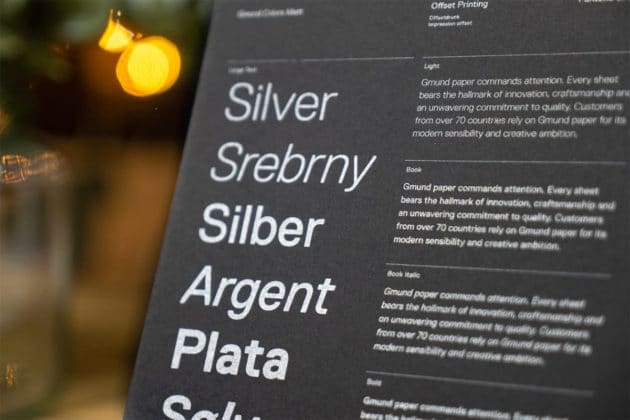
Like colors, typography is an essential branding element. Each font has its own characteristics, which will reflect the overall mood of a website.
When creating a font combo, limit your choice to three varieties, at maximum. This avoids getting your readers overwhelmed with the many different font designs.
As choosing the right typography can be tricky, let’s see some tips for how to do it:
- Choose two fonts and add another only when necessary. Font pairing tools, such as FontJoy, can help you find the perfect font combination for your site.
- Make sure to use the appropriate size and shape. The former helps create a visual hierarchy on your site’s content. The latter establishes a feeling to the content’s elements, such as professionalism or sophistication. For example, using a sans serif font to design content headers may have a more powerful impact than the serif family.
- When in doubt, combine fonts from the same typeface family. Variations such as thin/thick and condensed/extended can help create contrast. For example, it’s no problem if you want to pair Arial with Arial Black.
7. Put Essential Elements Above the Fold
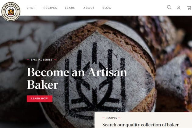
Image Source: KingArthurBaking.
Above-the-fold content is what site visitors see right away after landing on a website. Such content should be able to convey what a website is about. When done correctly, a site’s above-the-fold content can showcase a website’s value proposition to the target audience.
Here are several tips for optimizing a site’s above-the-fold design:
- Keep the design simple. The above-the-fold part of a website shouldn’t be too noisy. Webmasters only need a strong headline and a unique tagline to introduce their site to the visitors. Also, be mindful of your color choice.
- Provide clear navigation. One of the fundamental above-the-fold elements is a menu bar. Keep your visitors engaged by providing only the essential items. Apart from maintaining design simplicity, it also prevents decision fatigue for site visitors.
- Display a captivating visual. Adding a featured image, GIF, or video is a great way to grab visitors’ attention.
- Avoid a false bottom. Many websites have excellent above-the-fold content. However, some of them may create the impression that there’s no other information on the page. To prevent this, make the content below the fold partially visible or add subtle directional clues to encourage visitors to scroll through.
You may also like: How to Avoid the Duplicate Content Issue for Google?
Conclusion

Here is a quick recap of the seven easy design tricks we’ve listed in this article to help elevate your content quality:
- Use white space to highlight important information.
- Use optimized images to maintain excellent website speed and user experience.
- Keep the colors consistent so that your target audience can recognize your brand quickly.
- Create compelling calls-to-action by using bold colors, strong action words, and a sense of urgency.
- Pay attention to content structure, including keywords, title, and subheadings.
- Choose the typography well, as it helps create visual hierarchy and engage visitors to read your content.
- Put high-quality content above the fold to attract your target audience.
By applying the above strategies, you’ll improve user experience and the website’s chances of ranking high on search engine results pages.
Also, following the digital marketing trends will help you stay ahead of your competitors. Therefore, don’t stop learning, and good luck!


