So, you’ve taken a leap and finally created your own website. You’ve uploaded a bunch of material and written blogs to attract potential customers but you still feel like your conversion rates are not where they should be in order to build your brand further. If that is indeed the case, then you should look into some tried and tested trends in web design that will help you gain more leads. Many top websites in the world employ such trends in their own designs, and it’s time for you to start doing so too.
Ditch Designing for Various Devices

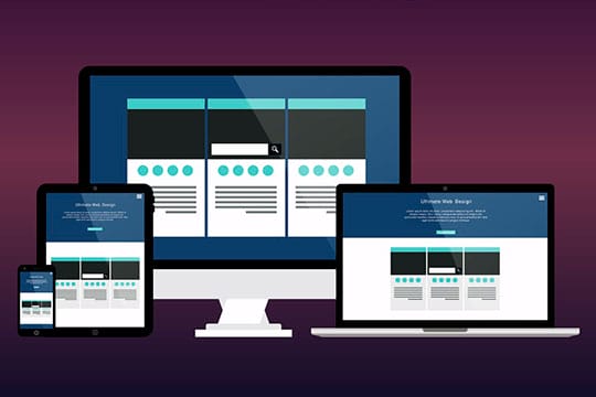
There was a time when websites were designed only for one device: the PC. That was because a computer was the widely available thing you could surf the internet with, so all you needed to do was design for a certain number of screen sizes and that was it. But now, as the number and types of internet-enabled devices is increasing day by day, you need to ditch this approach and tackle web design from a wider point of view. Design your content in a way that is not only viewable on different devices but can also be reproduced via voice, so that devices like the Google Home can also access the information when needed.
Recommended for you: TOP 3 Apps for Web Designers for Their On-the-Go Tasks.
Improve Visual Design

In order to attract more people to your site and keeping them there for longer periods of time, make sure your content looks good. Use interesting design elements like double exposure images, plenty of white space between different elements, bold and contrasting colors that grab attention, and lesser text. You can also use proven design techniques like the Rule of Thirds and incorporating black backgrounds for product shots to make them pop in order to create focal points on your webpage.
The minimalist design seems to be all the rage these days, so you can also incorporate that into your website. People respond more to visual trends that they see in other places, so do your research and find out what kind of themes are popular in order to give your website a similar look and feel.
Start Getting Personal

By getting personal, we mean that your content should adapt to the user that interacts with your website. This new concept of personalization is starting to kick off and it’s better if you go over its pros and cons first, but if done right, it can mean that each user feels like the web content is designed just for them. This can be done by taking into account their search interests and geolocation to put relevant content in front of them.
Use Multistep Form Design

Ask yourself: would you rather fill out a form with ten questions on the same webpage with little text boxes or would you rather fill the same form if it’s designed to ask one or two questions per page? This kind of form design has really picked up in the last year and has led to much higher conversion rates. That is because having one question to answer on a clean-looking webpage is easier than having to deal with ten times the information. Check out this case study to see how brands are jumping to this design trend to gain more leads. Long, complicated forms are one of the reasons why people leave websites without ever checking out with a product they like, so make sure you embrace multistep forms.
You may also like: 5 Website Design Must-Dos for Maximum Business Growth and Success.
Make it Quick

If you want people to stay on your website for longer and buy your products or services, you need to make sure they don’t get frustrated, and one of the biggest causes on online frustration is long waiting times. So, you need to optimize your website in a way that allows people to navigate it quickly without having to wait for new pages to load. Resize your images if you have to but don’t make users wait because most of the time they’ll just leave. If you’re worried about losing content quality, you can sharpen images to make them look clearer instead of uploading 50MB files with 300ppi.
And with that, we conclude this brief guide to help you generate more leads on your website. When designing a webpage, you need to remember that this is the age of all thing’s internet, and people are highly impatient which puts you in a very tough spot as a designer. Your designs need to look visually pleasing while being lightweight, your content needs to be relevant to your audience and available at every possible digital device. Only these things will give you the edge in the online world today so it’s time to get on board with some of the leading design trends of 2019.


