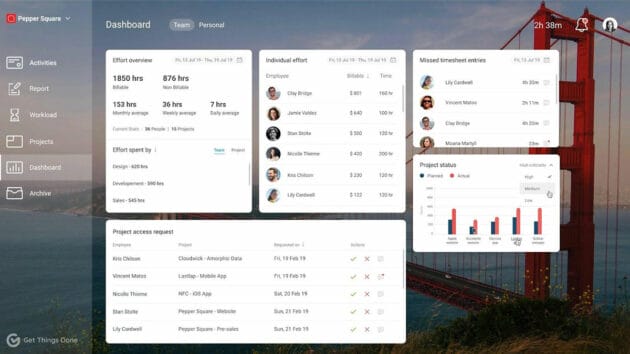
Everyone uses it. Every day even. However, little thought has been given to this underrated productivity tool in our lives — a dashboard. Any dashboard UI nowadays is integral for companies and employees, especially in a post-pandemic hybrid world.
Hence, we are going to be exploring some of the best UI best practices and design approaches and the top brands that have done it right. By following these best practices and design approaches, businesses can create effective dashboard UIs that support their decision-making processes.
What does it take to make one? So why do most of them look essentially the same? And why is it called a dashboard? Well, let’s start with the terminology.
What is Dashboard UI, and Why is It Called So?
Imagine being a pilot or an astronaut. You need a control system to navigate through the skies/space. Those buttons, levers, and everything else make for the dashboard, where users can find everything they need in a dash.
In fact, the automotive industry should be credited for the word “dashboard”. It usually refers to the panel in front of the driver that gives a glance at engine parameters, like speed, fuel, and temperature.
The term “Dashboard UI” came into common parlance only in the early 2000s. Especially when businesses started collating and analyzing large amounts of data to make informed decisions. For the UI world, the term refers to the digital interface, the real-time display of the key performance indicators (KPIs) that helps the decision-makers assess the organization’s health. It gives them the ampere to identify areas that require attention with the help of this visual display of data.
Dashboard UI has gone through an evolution, however. The rise of mobile devices, the changing preferences by designers, and data visualization techniques such as heat maps – all have added the need for dashboard UI to be more accessible.
Related: Designing for Accessibility: A Digital Product Designer’s Guide.
Effective Dashboards are Goal-diggers
Despite several advancements, however, the fundamental goal of the dashboard UI design remains the same:
- Provide users with a clear, specific, and concise view of critical business information.
- Enable them to make informed decisions quickly and effectively.
By following design conventions, tips, and best practices, designers can create dashboards that balance usability and efficiency with creativity and innovation, ultimately helping organizations to achieve their goals and excel in a competitive landscape. It’s like a super-powered tool that enables you to understand what’s happening and steer your business or project in the right direction!
Here is Why Most Modern Dashboards Look Similar
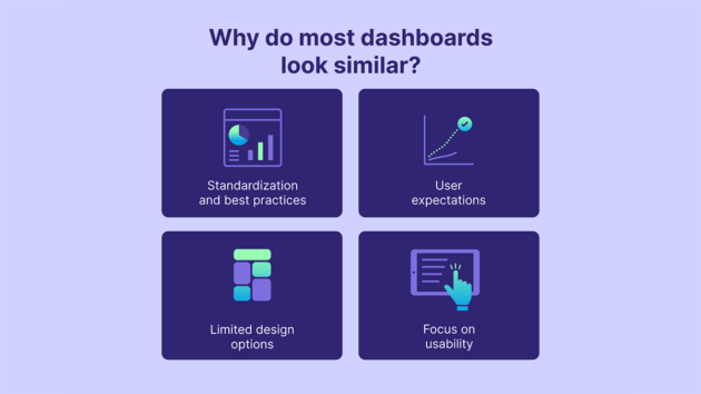
Have you ever noticed how most modern dashboards look like long-lost siblings? It’s like they all attended the same design school and graduated with honors in “Dashboard Aesthetics 101.” But why is this the case? Why do they all seem to have an uncanny resemblance? We are about to uncover the mystery behind the remarkably similar UIs of these data-measuring marvels.
Standardization and best practices
Specific design standards and best practices have emerged over time for strategic dashboard UIs. These include using clear labeling and navigation, appropriate data visualizations, and providing context and insights. Many designers follow these standards and best practices when designing dashboard UIs, which can lead to similarities in UI.
User expectations
Users have now come to expect specific features and functionality from dashboard UIs, such as the ability to drill down into data, customize views, and filter data. As a result, designers may incorporate these features into their dashboard UIs to meet user needs and expectations. This can also lead to similarities in UI.
Limited design options
Dashboard UIs often present large amounts of data in a limited space, making creating a visually appealing and unique design challenging. As a result, designers may opt for a more minimalist or functional design to accommodate the data, which can lead to similarities in UI.
Focus on usability
The primary goal of a great dashboard UI is to allow users to understand and analyze data. As a result, designers may prioritize usability over aesthetic appeal when designing dashboard UIs. This can result in a focus on clear labeling, easy navigation, and intuitive data visualizations, leading to UI similarities.
Then there are also the other minor factors that shape dashboard UIs worldwide. For instance, no one can reinvent the wheel. There is a reason why people are used to dashboards where the control panel comes mostly on the left, and the chat or delegation work comes on the right. What can truly make your dashboard UI stand out are the unique branding UI elements, experimenting with color and typography, and incorporating unique features and functionality while still meeting users’ needs.
UI Dashboard Design Best Practices with Dashboard Design Examples
Dashboard UI is the forerunner in this data-driven decision-making digital world. With their interactive user interfaces and quick access to data analytics and insights, they help businesses make informed decisions. So how can we create a customized, well-designed dashboard for your business?
Keeping it simple and easy to navigate
Dashboards need to be intuitive and easy to navigate. Otherwise, how will the end-users coming from different walks of life go about using it? A cluttered dashboard with way too much information is cramped in can easily confuse users and make them want to leave. A simple, clean, and modern dashboard design with clear navigation and labeling is crucial for making your dashboard UI effective. Easy access should be the key phrase here. Every dashboard user should spend less time searching for information.
Google Analytics: One of the best dashboard example
Google Analytics, which is widely regarded as one of the best, has an operational dashboard that is effective and easy to navigate. The main analytical dashboard displays a summary of key metrics, and users can quickly access more detailed information by clicking on the various tabs and links.
Use clear and concise labeling
Labels should be clear and concise, using simple language that is easy to understand. Avoid technical jargon and acronyms that may not be familiar to all users. Using icons and images can also make labeling more visual and intuitive.
Slack: Best example of dashboard design UX with great UI inspiration
Slack is an excellent dashboard UI example with clear and concise labeling. The platform uses simple language and clear icons to label each dashboard section, making it easy for users to find what they need.
Choose the right data visualizations
Data visualizations can be chosen based on the type of data being presented and the insights that need to be communicated. With the help of different types of dashboard visualizations (such as charts, graphs, and tables), data can be displayed differently, depending on the user’s needs.
Tableau: Excellent dashboard design example with the best dashboard UI
As a powerful data visualization tool, Tableau provides an extensive range of options for displaying data. The platform offers a range of charts and graphs and more complex visualizations, such as heat maps and tree maps.
Make it visually appealing
Aesthetics are essential in great dashboard design, as they can affect user experience, engagement, and satisfaction. A visually appealing dashboard UX makes data interpretation seem effortless.
Trello: A user-friendly dashboard layout that follows best design practice
Trello‘s dashboard is a great example that may inspire a visually appealing design. The platform uses bright colors, clear icons, and clean lines to create a clean and attractive interface that is easy to navigate.
Provide context and insights
Dashboards should present data and provide context and insights to help users make informed decisions. That’s where annotations, captions, and other text-based elements come into play.
Hubspot: A perfect design inspiration for a custom dashboard
Hubspot‘s dashboard provides context and insights through annotations and captions. The platform also includes helpful tips and advice throughout the dashboard, providing users with additional context and guidance.
Following these basic design principles, you can look to create an effective dashboard UI that helps users to navigate complex data and make informed decisions. To summarize, these basic dashboard design principles are like the ingredients of a well-prepared pizza. There must be a balance – with the right amount of sauces, cheese, and toppings. The crust should be crispy but not overly hard, allowing for easy slicing and serving.
See also: How to Use Web Design and Content Optimization for User Engagement?
Best Dashboard Design UI: A Designer’s Guide for a Great Dashboard UX
Returning to the pizza analogy, even if you have the right ingredients, base, and sauce, you must create the right environment to bake it perfectly. For that, the designer needs to wear many hats.
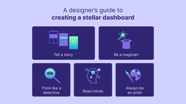
Think like a detective
Approach designing a dashboard like how Agatha Christie would solve a mystery. Investigate the data, use the visual cues and charts to help guide your investigation, and uncover the insights that will help you as a designer improve your craft.
Take out the crystal ball
Seems too far-fetched for a designer? Not really. A sign of good designer is to anticipate your users’ needs and create a dashboard that gives an in-depth insight into what your users want and when they want it. That’s why we call dashboard UI designers no less than mind readers.
Tell a story
We all love stories. And with a good dashboard, you can tell a compelling story with data. Harness the power of storytelling to create a narrative that engages and informs your users. It is all about reusing visual cues to bring the data to life.
Be a magician
What makes a good dashboard great is intuition. And a bit of magic in the form of motion graphics will help with data visualizations and make your dashboard stand out. In our routine lives of staring at several dashboards, a small surprise can delight your users and make them want to return.
Always be an artist
A good dashboard is part art and part science. Rope in creativity, color, typography, and layout to create beautiful, visually engaging, yet functional art your users prefer.
Designing for Web and Mobile: What Type of Dashboard Design Principles to Consider?
Dashboards are no longer built for swanky desktops. As a UI designer creating dashboards, a few things need to be remembered to make the dashboard UI design look spotless.
Screen size and resolution
We are looking at a vast difference here – from 6 inches on a mobile to 25 inches on a desktop. As a result, designers need to be mindful of how much data can be displayed on both screens. For mobile, while it is about optimizing on smaller screens and lower resolutions, for more giant screens, it would be about prioritizing using appropriate data visualizations to make the most of the screen space.
Navigation
In what ways will dashboard navigation be different for a mobile device when in comparison to a desktop or laptop? For example, are users more likely to scroll vertically on a mobile device? Or more likely to click menus or links on a desktop or laptop. Therefore, designers should consider this when designing mobile dashboard UIs and providing easy-to-use vertical scrolling navigation.
User behavior
Mobile users tend to have different behavior patterns than desktop or laptop users. For instance, they may be using a mobile device on the go, in a more casual or distracted setting, and may have different needs and expectations compared to desktop or laptop users. Therefore, the design team needs to understand these differences in user behavior and design dashboard UIs that meet the needs of mobile users.
Responsive design
Unlike desktop or laptop screens, mobile devices come in various sizes and resolutions. Therefore, designers must use responsive design techniques to optimize dashboard UIs for different screen sizes and resolutions.
Performance
Mobile devices often have slower processing speeds and lower bandwidth compared to desktop or laptop computers. Designers should consider this and design dashboard UIs optimized for fast performance on mobile devices.
Overall, designers should consider these key differences between mobile and web dashboard UIs when designing for each platform. By understanding the needs and behaviors of mobile users and optimizing for limited screen space, navigation, and performance, designers can create new dashboard UIs that are effective and user-friendly on mobile devices.
FAQs

How can we ensure successful dashboard reporting?
To achieve success in dashboard reporting, it is important to follow a four-step approach:
1. Plan the dashboard with clear objectives and identify the relevant KPIs to track.
2. Conduct data discovery to evaluate data sources.
3. Design with user-friendly visual elements.
4. Implement the dashboard and test its functionality.
What are the differences between a dashboard and a web page?
Well, they both can open up on a computer screen, but the similarities end there.
A dashboard is for quick data consumption and is a vital visualization tool that gives an easy-to-digest overview of organizational and individual-level KPIs. With the help of interactive visual elements such as charts, graphs, tables, and gauges, dashboards are designed to help users analyze and make informed data-driven decisions.
Alternatively, a web page is a document displayed on a web browser and contains text, images, videos, and other multimedia elements that provide important information. Many times it promotes a product or service. It may have links to other web pages, and users can interact with it by filling out forms, making online purchases, or performing other actions.
How many visuals should be on a dashboard?
To ensure visual clarity, limit the number of visuals included in a dashboard to two or three. Including too many visuals can make it look cluttered and difficult to interpret.
What are dashboard UI kits?
Dashboard UI kits are pre-designed collections of user interface elements, templates, and components. They are specifically created for designing and building dashboards. These kits provide a foundation for developers and designers to create visually appealing and functional dashboards quickly and easily.
They typically include a variety of charts, graphs, tables, buttons, icons, and other UI elements that are commonly used in dashboard designs. These kits can be highly customizable as per the objective of a dashboard. It allows users to modify and adapt the components to fit their specific design project requirements. They are often used in web and mobile app development to streamline the design process. They help to make sure that your dashboard is consistent in its overall look and feel.
Related: In-House Web Design vs Freelancer vs Agency: A Complete Guide.
Author: Alka Jha
We have written this article in association with Alka Jha. As Pepper Square‘s Chief Creative Officer, Alka always pursues UI UX design excellence. A Yoga lover, for her, it’s all about innovating with purpose. You can follow her on LinkedIn.
