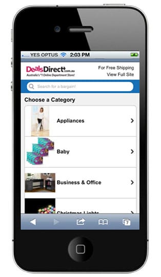
As most developers and users alike already know, the search box is a combination of an input bar and a submission button. Many developers may think that search boxes don’t really need much of a design due to the simple elements that make up this important site tool. However, this is simply not the case since the search box is more often than not, the most used design component on a website, especially on eCommerce and content-heavy sites.
When a user is on a site and is having difficulties navigating the site or finding what they are looking for, they almost always look for a search tool to help them find it. Site visitors want to access this capability as quickly and as easily as possible. If it becomes too much of a hassle, they will leave the site and will probably never return, making usability and design essential aspects of web design.
Let’s take a look at how this feature can be improved in order to help site visitors navigate any given site virtually hassle-free.
Search Box Best Practices

1) Always Incorporate a Magnifying Glass Icon in the Design
![]() Icons are used for so many different things in order to help users identify something. For example, the universal recognition for “search” is the magnifying glass icon. Interestingly, the magnifying glass is one of the few most universally used and recognized icons out there today, and users really don’t need a textual label to know what the magnifying glass means.
Icons are used for so many different things in order to help users identify something. For example, the universal recognition for “search” is the magnifying glass icon. Interestingly, the magnifying glass is one of the few most universally used and recognized icons out there today, and users really don’t need a textual label to know what the magnifying glass means.
Design Tip: Try sticking with a more schematic magnifying glass designs to help keep the recognition speed operating at optimal speed.
2) Prominently Display Search Fields
If users of any given mobile site/app require constant use of the search box, then search field boxes should be clearly and prominently displayed to help site visitors locate it quickly and easily.

Design Tips: Use full open-text fields and avoid search box designs that hide behind another icon. This makes the search box difficult to notice. Additionally, avoid search boxes with progressive disclosure because they can also be difficult for users to find at first glance.
3) Design a Search Button Separate from the Search Box
Designing a separate search button makes it easier for visitors to recognize that there is an additional search step. This actually helps trigger more search action on any website. If it can be designed to allow the user to just press Enter to search, even better!
![]()
Design Tips: Be sure to design the search bar area with a large clickable area and allow users to press enter when they finish typing their search terms. These design ideas will make the search box much more user-friendly.
4) Place the Search Bar on Every Page
No matter what page site visitors are on, they may suddenly have the need to search for something. If they have to switch pages and look around for a search field or box, they will most likely get frustrated and just leave. Did you know in the worst case you could get sued for product liability? Welcome to 2017.
5) Both the Desktop and Mobile Site Should Have a Search Bar
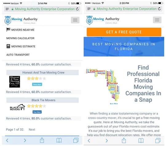
If your desktop site has a search box, then your mobile site should have one as well. Since a majority of site users visit a website via the mobile site, the site should be as user-friendly as possible. In the illustration below, the site below does not have a search bar on their mobile site whatsoever, but when you visit their desktop site on the same page, it has a fully interactive search bar and a map where visitors can search for moving companies by clicking on a state.

The desktop site only had a search bar on one page, which could be costing them site visitors because not all visitors will land on this page. Additionally, since the option is not available on their mobile site whatsoever, they could be losing a lot of mobile traffic as well. Since this page is for users to find a moving company in their chosen state, you can see that there are 32 results. This means the user will have to scroll through each page, click on different moving companies, and guess which moving company is best. This is what a prominently placed search field is meant to eliminate.


