Having a distinctive and memorable logo is one of the simplest ways to differentiate a brand; nevertheless, designing a unique and memorable logo is not as simple as it seems. Here are 20 typical logo design mistakes that inexperienced logo designers frequently make.
Read them below and make sure that you don’t incorporate them into your design. We have not written them in any specific order so there is no specific priority attached to any of them.
1. Typographic issues

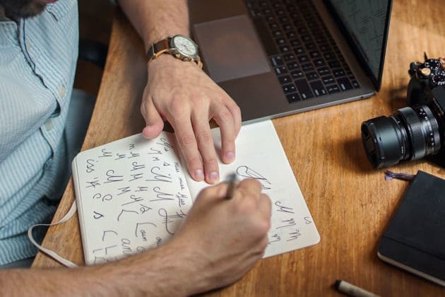
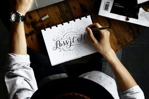
Typography in logo design is one aspect that can literally make or break a design, thus knowing your typographic ABCs is essential. A logo should be kept simple while still conveying the desired message, and in order for this to happen, all typographic components of the design must be considered.
Use a limited number of typefaces and weights (two maximum). Don’t use boring, out-of-the-ordinary, or thin typefaces. Pay great attention to kerning, spacing, and scaling, and most crucially, make sure you’ve picked the appropriate font(s) for the job.
Recommended for you: How to Create an eCommerce Logo? (+ 3 Best Online Logo Makers).
2. Bad font choice

As previously said, when it comes to designing a logo, selecting the appropriate typeface may greatly affect the design. Font selection may frequently take as long as creating the logo trademark itself, and that should not be rushed.
Spend some time studying all of the many fonts that may be utilized for the job, narrowing things down deeper, and then comparing how each one fits with the brand mark. Don’t be scared to buy, adapt, or develop your own font. Also, consider how the typeface in the logo may be utilized in union with other typefaces and graphics across the company’s design.

3. Abstract or complicated design

Simple logo designs are more distinctive because they are easy to recognize; yet, for a logo to be unique and stand out from the rest of the logo design competitors, it must have something special about it that is not overdrawn. Not only can clarity make a logo better remembered, but it also renders the logo more adaptable, which means it can be used across a wider variety of formats. A logo, for instance, should function upon anything as little as a postcard and as huge as a signboard. Also, don’t make your logo too complex as that kills the creativity instilled in it.
4. Relying on different colors

If a logo needs coloring or special features to be considered powerful, it is not. To avoid this, start with either black or white colors and then add special elements or colors afterward. This enables you to concentrate on the form and ideas instead of the special effects. Drop shadows, engraving, and other surface styles should not be used to enhance logos; a good design will shine on its own. You may also create many variants of a symbol to test that it works in both color and grayscale.
5. Opting for raster vs. vector

One mistake that most beginner logo designers make is that they opt for raster images instead of vectors when creating logos.
A logo must be created in vector format using software such as Adobe Illustrator so that the finished logo can be scaled up or down – to any size – and simply transferred to different media. A vector design is constructed from mathematically accurate points, ensuring aesthetic consistency for all channels and sizes where the logo will be used. A raster picture (one consisting of pixels, such as those seen in Photoshop) cannot be stretched to any size; therefore, the logo would be worthless at huge sizes. When making logos, use a vector graphics application.

6. Creating monograms when they don’t make sense

Among the most typical mistakes done by a beginner, logo designers are attempting to construct a monogram out of the company’s initials (for example, Bob’s Appliances would become a brand created out of B & H). Even though this appears to be a common-sense way forward at first glance, it is difficult to establish trust or communicate an overall meaning with only the company’s initials. You should consider this option, but only if you can start with an exact, creative, and distinctive solution that matches the company’s aims.
Also, avoid abbreviating a company’s name unless it has been established for a time or if it fits the company’s purpose. HP, DHL, Microsoft, and Chevrolet were not born as acronyms in the first go.
7. Using clichés for logo design

Fluorescent bulbs represent ‘ideas,’ dialog boxes represent ‘conversation,’ swooshes represent ‘fluidity,’ and so on. These are frequently the first ideas that come to mind while researching, and they should also be the first ideas to be dismissed for the same reason. How will your design stand out when other logo designs use the same concept? Avoid these visual clichés by coming up with a unique concept and idea.
8. Copying design with no creativity

It’s unfortunate that something like this has to be even mentioned, but it’s an all-too-common occurrence nowadays. A design team sees a concept it likes, performs a fast mirroring, color swap, or phrase tweak, and then claims ownership of the concept. This is not only immoral, unlawful, and foolish, but you will also be found eventually. Use no stock or clip art – the goal of a design is to be distinctive and genuine.
9. Too many revisions kill creativity

Because a client pays you as an expert designer to create a meaningful design, you should steer the consumer to the best option feasible. The easiest method to accomplish this is to give your skills rather than allowing them to drive the endeavor (entirely). If a client requests an incorrect modification, explain why that might not be such a great idea and provide a better alternative option to them. If they continue to reject, consider submitting both your design judgments and their design preferences. They will frequently realize that their choices were not the greatest; but you as a design expert should also understand that you are not always right, so try and give the client’s suggestions a go – who knows where it will lead?

10. Giving numerous concepts to the client

Giving the client too many alternatives is somewhat related to the previous issue. This suggests that the customer will require more influence over the project’s design direction. If you present a business with ten concepts, they will almost always select the ‘worst’ design. A decent rule of thumb ensures to provide only a few concepts that you can foresee working for their company. Of course, the volume of designs you provide may vary depending on the job, but if you’ve gained enough confidence as a designer, these one-to-three concepts should hit the nail right on the spot each time.
You may like: Ready to Redesign Your Logo? Here’s How Big Brands Did It.
11. Not providing a clean logo

Logo documents should be one of the clearest documents you ever submit to the client. Node points in the client file should be reduced to a minimum, and curves should be made as smooth as possible without any overlap.
Logo design shapes should be integrated, and your logo should be precisely symmetrical if it is symmetrical. All the things about the provided logo design files should be flawless and as brief as feasible. Consider the possibility that the customer will need to enlarge the logo to fit on the side of a truck. If there are any errors in the logo, they will now be obvious. Make it flawless.
12. Delivering wrong files to clients

Providing the correct files to your customer is one approach to ensure that they never request updates or variants of a logo. It also guarantees that the logo is accurately shown in all situations, which should be backed by a style guide.
13. Drawing your own business logo

You are not starting a business just for the sake of starting one. As a result, DIYing a logo for your firm is pointless; a professional is required. Your company’s aims and reputation are defined by its logo. You can’t just make any old logo for it.
Experts are well-versed in the tasks that must be completed while establishing a brand’s logo. An amateurish logo might erode potential consumers’ confidence.
14. Using clip art for creating logos

If you want to create a logo, you might consider using clip art. But, in order to make your logo design stand out, I recommend avoiding it. Create your own symbol or mark to make your design unique and spectacular. The clip art is overly used for almost everything available online. Your logo won’t look unique if you use clipart for creating your logo design. Our recommendation is to choose different graphics that are available at a cost. This way not everyone will be using such logos.

15. Avoid vibrant colors

Colors have much too much influence over human feelings. If you are not attentive to the color scheme you select in your design, you may make a serious error that will have a negative impact on your business.
Colors that conflict or coincide with each other might alter those sensations. Be creative in the use of color in your logo if you want your customers to connect with your business on an emotional level.
16. Paying too much for logo design

In the past few years, several huge corporations have invested money, and in some cases, thousands of euros on company logos. You are not required to do so.
Businesses may use the Looka logo builder to create free logos. You may experiment with the logo creator and try out several designs until you find the one that works best for you. When you already have many unique logo design services available over the internet that can offer low-cost options, why pay a fortune for getting your logo designed?
17. Lacking attention to detail

If there is one aspect that distinguishes an excellent logo, it is precise workmanship. When creating a logo for your company, you cannot afford to have a bad scale, insufficient color texture, or an incorrect aspect ratio.

18. Overcomplicating logo

If you have a fascinating idea/concept, it’s easy to get carried away with the logo design. Overcomplicating the design of your logo, on the other hand, might clog its overall appearance. Furthermore, when the logo design is intricate, the chances of making mistakes increase.
19. Not creating a balance

Symmetry is critical in corporate identity since most people perceive and envy a well-balanced design as more appealing and agreeable. Ensure that the overall logo has a good mix of colors, images, and size.
Understand that your logo represents your firm to the entire globe and is seen by many people, including famous designers. A well-balanced design is the most effective and amazing way to utilize it.
20. Not getting inspiration before creating the logo

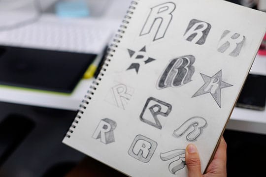
The idea here is to build a certain style or theme by gathering pictures or words that best reflect the brand’s personality. The mind map can greatly assist you in determining what to seek. Consider patterns, textures, colors, forms, typefaces, people, objects, goods, and so on, but don’t just throw images at random; consider what they signify in relation to your client brief. Sometimes you don’t need the entire picture as a reference, only a section that you especially enjoy. So, save it, crop it, and include it.
You may also like: Logo Design Trends in 2022: An In-Depth Breakdown.
Ready to get your logo designed by experts?

Avoid making the above 20 design mistakes when crafting your logo. By doing so, you’ll create a much more effective and professional-looking logo. This will help represent your business in the best possible light. If you are unsure of how to create a logo, there are many professional designers who can help you create a logo that is perfect for your business. Thanks for reading!
This article is written by Jennifer David, the digital marketing executive from Unique Logo Designs. Jennifer is a professional blogger. She is an expert writer in web design, cloud hosting, business & technology niche.


